Article category: Science & Technology, Company News
Descartes Labs Platform Emerges from Beta with First...
About 15 months ago, Descartes Labs entered beta to gather feedback from customers on our progress...
At Descartes Labs, we often dive deep into the technical aspects of geospatial intelligence, the rigorous analysis, and all the rich data behind the findings as we seek to solve complex problems. In this article, we get back to the basics, to the fundamentals of remote sensing. This is a nice refresher for veterans and those with some knowledge in this industry and a good introduction for novices to get an understanding of what remote sensing is, related terminology, and use case examples.
Remote sensing can be any collection of data when a sensor is not directly in contact with what is being measured. For example, a temperature reading from a thermometer does not constitute remote sensing since the sensor is taking a direct measurement.
Satellite images, on the other hand, are acquired through remote sensing since they are sensing emitted or reflected energy from the surface of the Earth from 100s of miles in space. That is, they are not in direct contact with the Earth’s surface, which is what they are measuring.
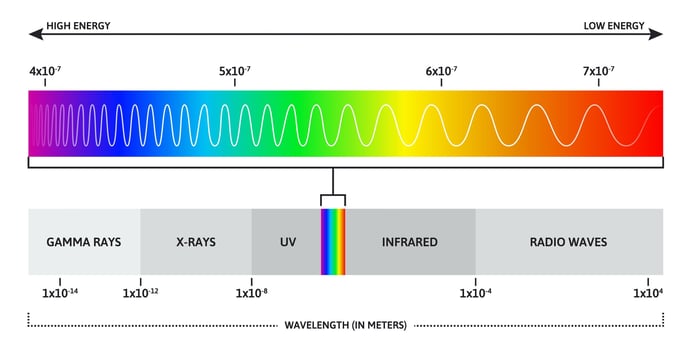
Let’s take a look at the electromagnetic spectrum, and let's talk about it in the context of remote sensing. Not all electromagnetic radiation hits the Earth; the upper atmosphere absorbs gamma rays, X-rays, and most UV light. The parts of the electromagnetic spectrum that do make it through the atmosphere are thanks to what are called “atmospheric windows.”
For example, visible light passes through, and this is what we see with our eyes. While the majority of infrared radiation is blocked by the atmosphere, some does get through, and though we can’t see it with our eyes, satellite sensors can. We'll take a look at satellite imagery, looking at near infrared and short wave infrared, in a moment.
The atmosphere affects almost all remote sensing data. Atmospheric conditions can change the amount of electromagnetic radiation that reaches the Earth’s surface and that travels back through the atmosphere to a sensor. Atmospheric particles, the angle of the sun, and weather can all impact image quality. Removing atmospheric effects reveals the reflectance the sensor would record if it were just above the surface of the Earth.
Of course, what sits between the Earth’s surface and the satellite is the atmosphere, and this can distort almost all remote sensing data. Clouds can completely block the signal, water droplets can scatter it, and the sun can enhance or diminish reflectance. Irradiance is what we call the raw data, with no correction to it. We can correct data to be indicative of what the signal would be at the top of the atmosphere, but to get a true understanding of what’s happening just above the ground, we need to correct to what is called "surface reflectance".
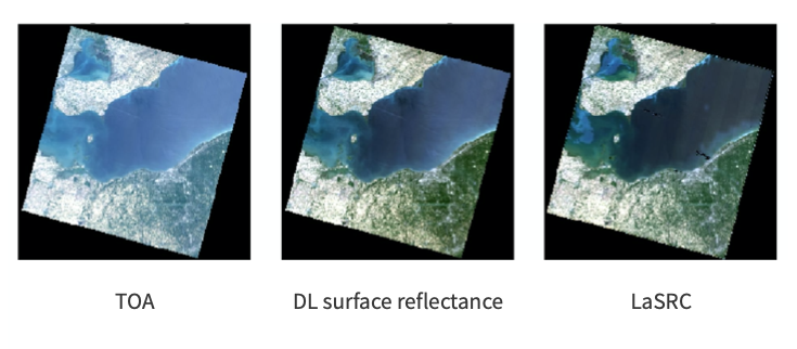
The images above illustrate how visually different an image can look between top-of-atmosphere and surface reflectance. On the left is a top-of-atmosphere (TOA) corrected image. You can see that it's not quite as vivid as the surface reflectance images in the middle and on the far right. The middle image is corrected using the internal Descartes Labs surface reflectance algorithm, while the one on the right (LaSRC) is corrected using the algorithm provided by NASA with their Landsat product.

Just like the atmosphere, different features on the landscape absorb and reflect electromagnetic radiation differently, and these differences allow us to map the Earth’s surface. Above, we show some examples over vegetation, water, urban areas, and snow.
Looking at the upper left example, you can see that vegetation absorbs blue and red light, but slightly reflects green light, which is why we perceive vegetation to be green. You see much higher reflectance values around near and short wave infrared, which has to do with photosynthesis, as plants strongly reflect infrared light. Here, we're looking at NASA Landsat data from 2020, with short wave-1, short wave-2, and near infrared data displayed as red, green, and blue, respectively. We can see the center pivot irrigation fields really pop out because they are so strongly reflecting those wavelengths.
The figures in the upper right shows an example for water. Water absorbs almost all of the electromagnetic spectrum. It has a slight peak at blue, which we can see, and this corresponds to how we perceive water bodies to appear blue. In this water example, we are looking at Lake Tahoe, and we can see that it's quite dark compared to the surrounding landscape.
Urban areas, in the lower left figures, pretty uniformly reflect all wavelengths. In the example, we're looking at Los Angeles, again with NASA Landsat. You can see that the ocean and the parks surrounding the city are darker in color, while the downtown area is very bright, as it's reflecting red, green, and blue light in the visible part of the spectrum.
Finally, the lower right example shows snow. We perceive snow as white; looking at the reflectance curve, we see that indeed, it is reflecting visible and infrared light very strongly. The image is of the Uintas in Utah, and we can see that the snow-capped peaks are very bright.
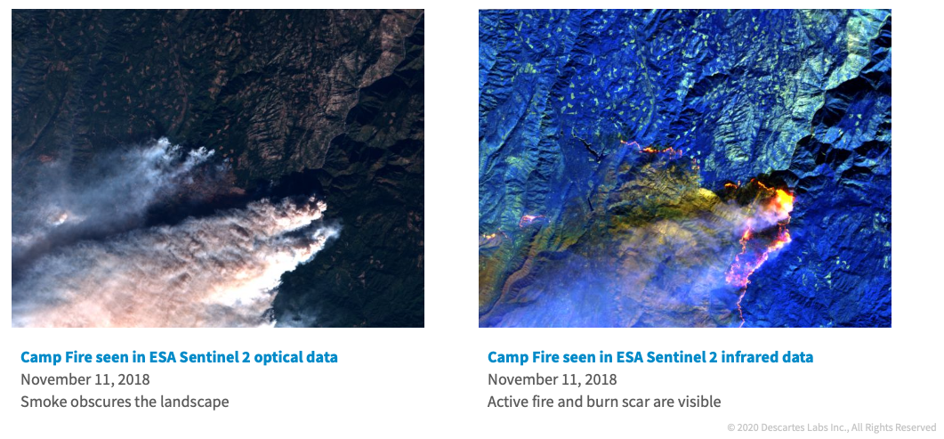
In a similar vein, we can look at radiation-target interactions. In the above images, we're looking at the Camp Fire, which occurred in Northern California in 2018. Both of these images were acquired by the Sentinel-2 satellite, which is operated by the European Space Agency (ESA).
On the left, we're looking at visible data in the red, green, and blue bands. This is what the landscape would look like if we were looking down from an airplane. We can see that there's a fire, because we see the smoke plume, but that's obscuring the landscape, so we can't see what's happening underneath the smoke.
On the right, we see the Campfire again in Sentinel-2 data, but now we're looking at the infrared bands. Those can penetrate through the smoke, so we're seeing the active fire in the bright orange color, and also see the burn scar to the southwest of where the active fire is. You have to consider what wavelengths are appropriate given the use case that you're looking at.
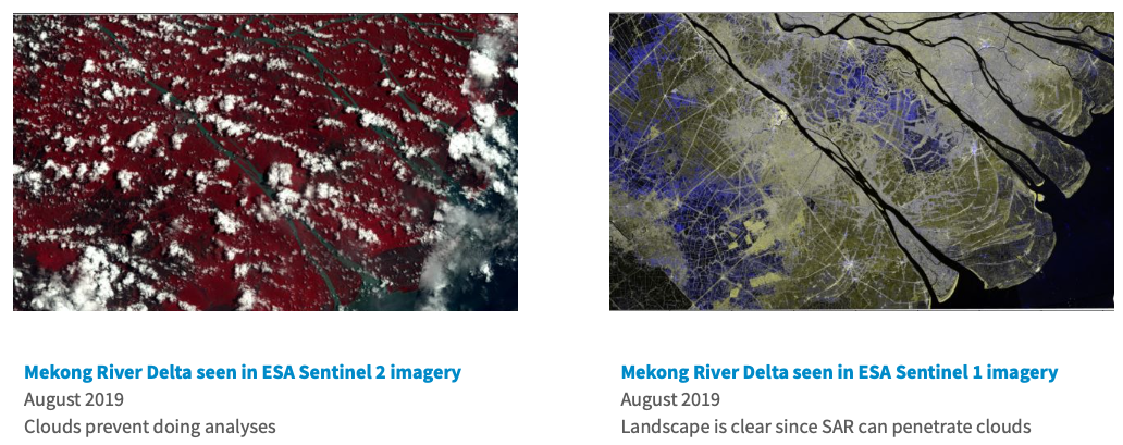
The above images show another example. This is the Mekong Delta in Vietnam. It's a very cloudy place that experiences monsoons, and complete cloud cover for much of the year.
The image on the left is ESA Sentinel-2 data, where we're looking at near infrared, red, and green bands. The image is quite cloudy, so we can't do much analysis of the landscape with the clouds blocking it.
The image on the right is also from ESA, but this time from their Sentinel-1 satellite. Sentinel-1 is an active radar sensor that penetrates clouds, so we see a clear shot of the landscape.
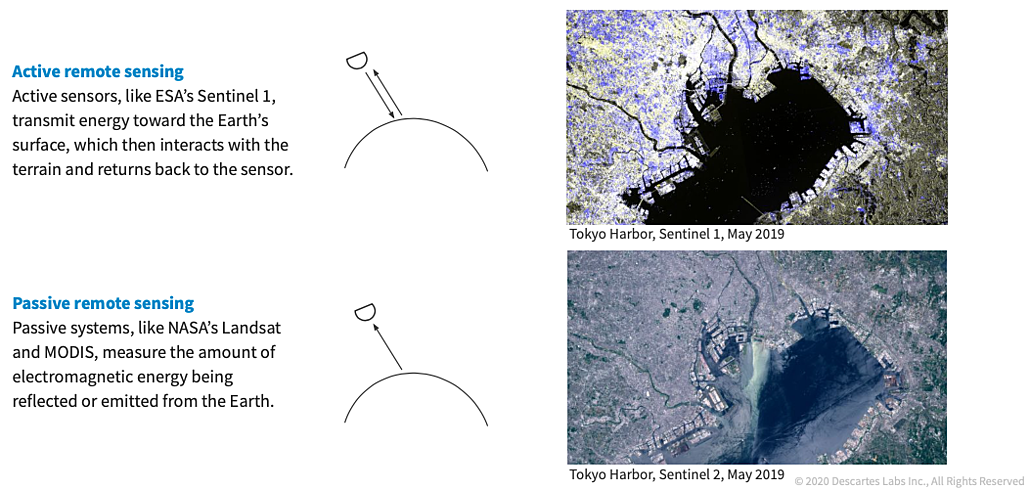
What is passive versus active remote sensing? We are most used to looking at data from passive remote sensing. Images from Google Maps, and most satellite imagery you see of the world, are almost always from a passive remote sensing system like NASA's Landsat or MODIS. The sensor is orbiting the earth, but it's simply collecting the amount of electromagnetic energy that's being reflected or emitted from the surface.
In active remote sensing, the sensor is actually emitting energy towards the earths’ surface, and then it measures how much is returned to the sensor. It's not always as intuitive to look at. Here, we see Tokyo. Buildings and urban areas tend to reflect quite a bit of energy back to the sensor. In water bodies, such as in Tokyo harbor, the energy hits the body of water and bounces away as if the water surface was a mirror. The energy is directed completely away from the sensor, so it looks very dark.
Switching gears, let's also talk about resolution types in imagery. There are three types that we'll touch on: spectral, spatial, and temporal.
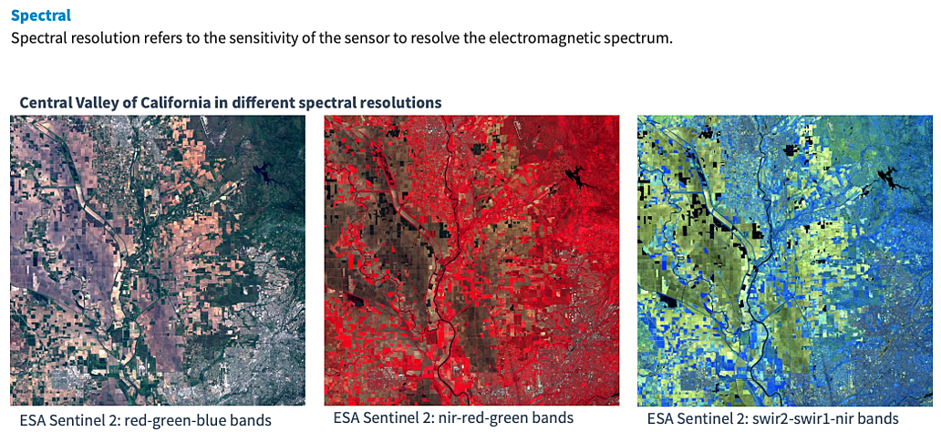
Spectral resolution refers to the bands that are being collected; how sensitive is the sensor to resolving the electromagnetic spectrum.
In the visual example, we're looking at ESA Sentinel-2 data. The first image shows red, green, and blue bands; this is the visible range and appears the same as what it would look like out the window of an airplane.
The middle image is looking at near infrared, red, and green bands, where we see all the vegetation popping out strongly as a red color, since near infrared radiation is being reflected very strongly.
The final image displays the two short wave infrared bands and near infrared. Here, we see agricultural fields emitting very strongly in the infrared bands, and are seeing more detail in the soil properties in yellow and brown.
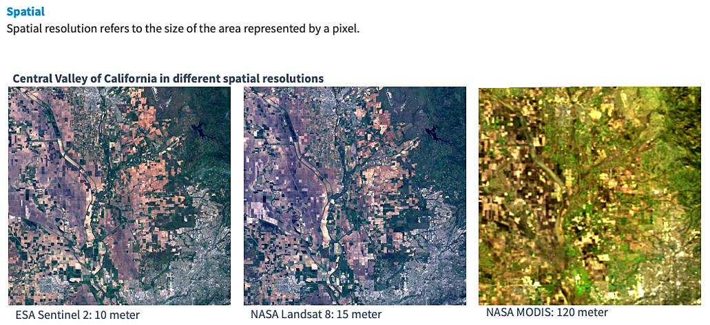
Spatial resolution is the size of the pixel; how much area on the ground is being represented by a pixel in the image.
Sentinel-2 visible imagery on the far left is 10m per pixel. NASA Landsat 8 is 15m per pixel, so we're not seeing too much difference there. NASA MODIS, on the far right, is 120m per pixel, and you can see that we're losing a lot of detail in the landscape by having that coarser spatial resolution.
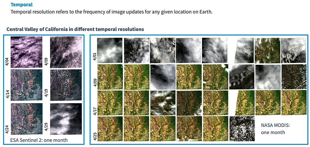
What we gain with MODIS is increased temporal resolution. Temporal resolution refers to how often images are collected for any given location on earth. For Sentinel-2 imagery, we're getting about six images per month, whereas for MODIS we're getting an image every day.
Generally speaking, the tradeoff is: the coarser the spatial resolution, the higher the temporal resolution, and vice versa. If we're getting very fine spatial resolution data, we're not getting it as often. Again, this is generally speaking, as there are now private satellites that are collecting data every day at a higher resolution, but this is the general tradeoff.
We use this data internally by our applied science team. Let's talk through a couple of use cases for how we've leveraged this data on our team.
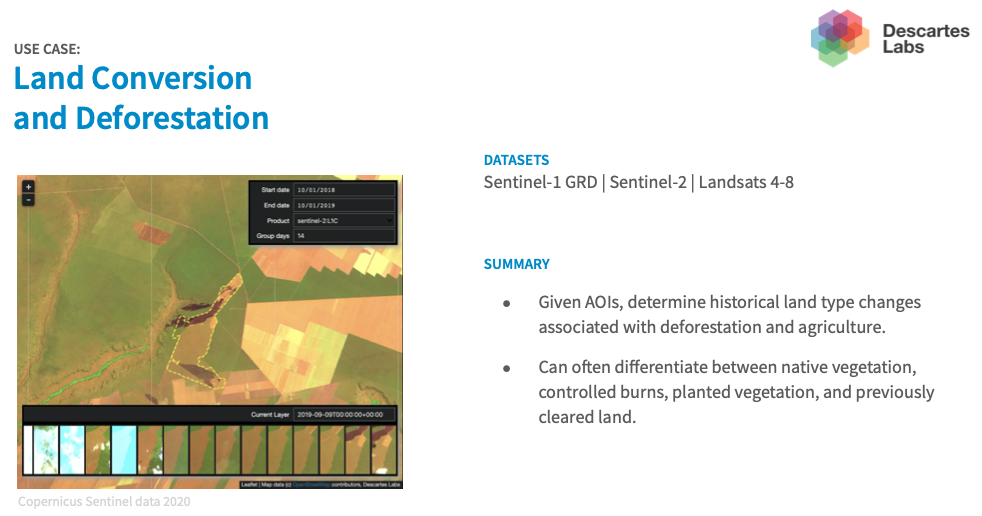
One thing we look at is deforestation, and whether that deforested area has then been converted to agriculture, or how it's used after it has been deforested.
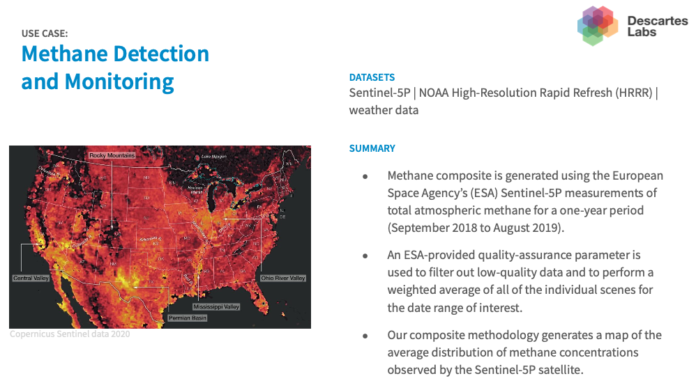
We use data from a relatively new sensor called Sentinel 5P from the European Space Agency. This collects information about methane, nitrogen dioxide, and other greenhouse gases and pollutants. In this project, we're mapping methane concentration over the US. We can see hotspots jump out in California's central valley because of rice paddy agriculture, and in the Permian Basin in southern New Mexico and Texas, due to oil and gas exploration.

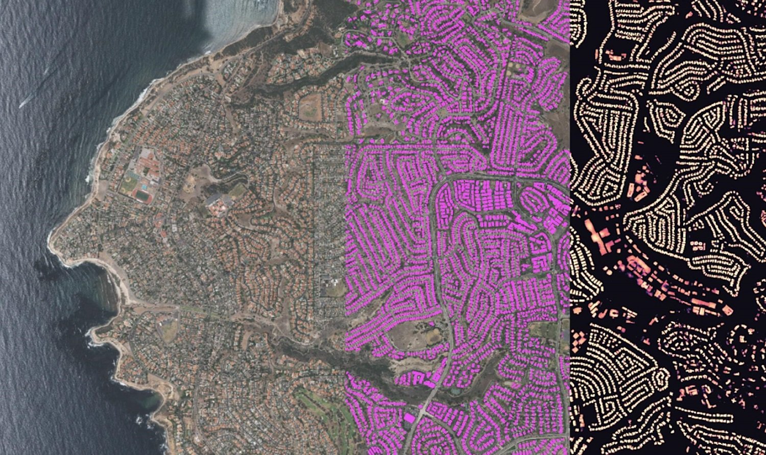
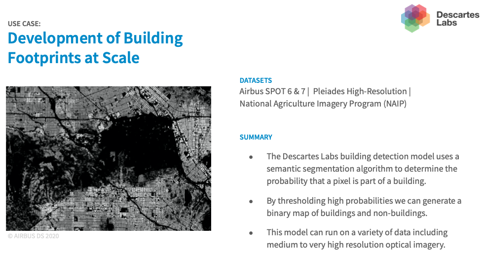
We also have computer vision capabilities. If we have very high spatial resolution data, we can map individual features on the landscape, such as buildings and tree crowns. In this example, we're looking at buildings in and around Griffith Park in Los Angeles.
We hope you enjoyed this refresher on remote sensing. Feel free to share, bookmark, or link to it directly to help educate others in one of the key fundamental areas of geospatial science.
Want to learn more? Read part two of our educational series on Types of Spatial Data and Coordinate Systems.