Article category: Company News
Announcing our $30M Series B
Today, we’re excited to announce Descartes Labs $30M Series B round of financing led by March...
Article category: Science & Technology

A choropleth map is a “thematic map in which areas are shaded or patterned in proportion to the measurement of the statistical variable being displayed on the map, such as population density or per-capita income.” We use choropleths to illustrate our crop yield forecast, which is ideally suited to the technique since the value illustrated is in fact a rate (i.e., bushels/acre).
GeoServer makes this pretty easy to do. I am using PostGIS for the back end and a SQL view for the layer definition, but that is not required. The important part is to produce a layer with a geometry, a date, and one or more “value” fields (I will use “x” and “y” here). Importantly, the layer definition needs to include all the dates. In the layer configuration “dimensions” tab, enable the “time” dimension and select the date field.
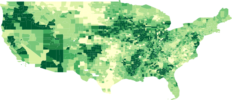
By selecting “Use the biggest domain value” as the default for the time dimension, I can guarantee that every time I render the layer it will show the latest data. You can override this default by specifying a time manually (for example) using a time dimension query parameter. For the basic styling of the layer, I use a “categorize” rendering transformation in CSS; which implements a 7-class YlGn color scale based on the “x” value of my layer:
* {
  fill: [categorize(
         x,
         '#ffffcc',
         100,
         '#d9f0a3',
         120,
         '#addd8e',
         140,
         '#78c679',
         160,
         '#41ab5d',
         170,
         '#238443',
         180,
         '#005a32',
         200,
         '#005a32')];
}
Using GeoServer, we can actually animate the layer using the WMS animator, which lets you see what is happening over time: geoserver/wms/animate?layers=descarteslabs:statistics&format_options=layout:message;gif_loop_continuosly:true&format=image/gif;subtype=animated&width=1200&height=600&aparam=TIME&avalues=2017-06–29,…,2017–09–09
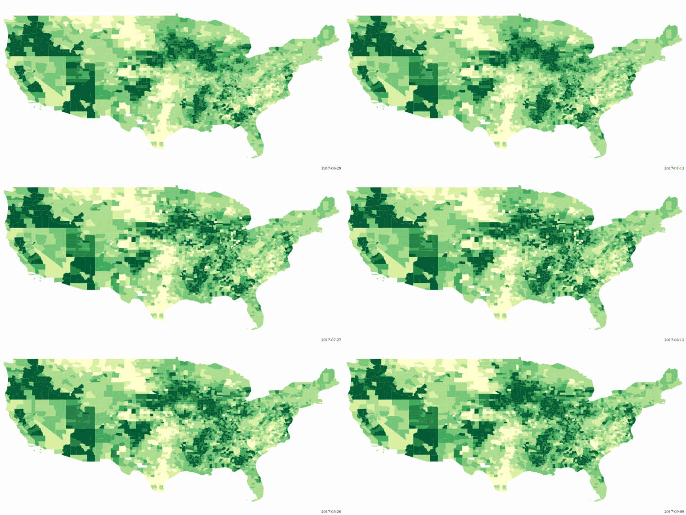
Another way to view the change over time is using the KML reflector in GeoServer. The reflector will output features with time stamps that will activate the “time slider” when loaded in Google Earth. In order to get the dates correct, we need to create a “time.ftl” template in the GeoServer data directory for the layer with the following contents (assuming our date field is called “date”).
${date.value}
Similarly, we use a a “height.ftl” template in the same directory to specify the field to use for the height of each feature. Here we are linking the height and color to the same “x” value; using the CSS above for the color and the height template for the height. The “?number” syntax ensures that the value is converted to a number before we multiply by an arbitrary scale factor for presentation purposes (height is in meters).
${x.value?number * 1000}
Now, we can request a KML file from GeoServer with all our shapes appropriately styled and time-tagged for animation: geoserver/wms/reflect?layers=descarteslabs:statistics&format=application/vnd.google-earth.kml+xml&time=2017–01–01/2018–01–01
So, here we have a 4D Choropleth; 3D+time… and it works! As a final step, we can actually use different metrics for the height and color. To do so, I just have to change the height template to use my “y” value (production in bushels), again scaled by an arbitrary factor for presentation purposes.
${y.value?number / 1000 + 1000}
Here is the final product; county level yields over ~2 months with total production represented by the height of each shape. The net effect is a general smoothing of height differences so that high producing counties are more prominent. Likewise, counties with high yields (dark green) but with a smaller percentage of planted acres will be less prominent on the map.
Finally, it is worth noting this technique can be applied to other types of data. As an example, here are summary statistics for our imagery catalog. I have created a TMS grid (zoom level 10) over CONUS and then aggregated the number of scenes (Landsat 7/8, MODIS, Sentinel 1/2/3) intersecting each grid cell for each month of the past decade. I use a PuRd color scale to highlight “hot spots” of increased coverage. There is a general seasonal “pulse” (with more imagery available in the summer months) plus a general increase in volume in the last year or two (from new data sources coming online).
Article category: Company News
Today, we’re excited to announce Descartes Labs $30M Series B round of financing led by March...
Article category: Climate Solutions
Today we’re excited to announce that Descartes Labs will create mapping and modeling capabilities...

Article category: Company News
We are thrilled to welcome Suzi McBride as our first independent director. Descartes Labs has an...
Article category: Science & Technology
There are at the very least six separate global land cover mapping efforts. The European Space...