Article category: Science & Technology
Searching the World Wide World
Today, we’re unveiling a technology demonstration of machine learning at global scale, which we...
There are at the very least six separate global land cover mapping efforts. The European Space Agency (ESA) just released an unprecedented 24 annual global land cover maps as a part of the Climate Change Initiative (CCI), tracking land cover over the period from 1992 to 2015. In the U.S., NASA has released a global land cover product derived from MODIS each year since 2001. Four additional global maps have been released since 2000 (GLC2000, GLCNMO, GlobCover, Globeland30), and global maps focusing on a specific land cover type are continually being published, e.g. cropland maps, like Global Food Security Analysis-Support Data (GFSAD30), maps of urban extent like the Global Urban Footprint, and forest distribution maps like Landsat VCF Tree Cover.
These are significant efforts. And developing a classification model to map land cover—the primary research activity—is often not the most arduous part.
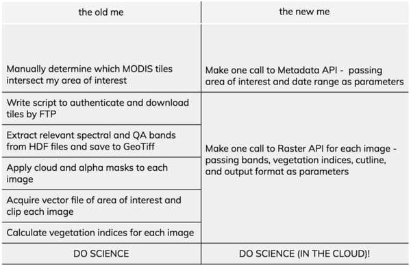
Just accessing imagery can be daunting. Multiple websites may host imagery acquired by the same satellite, some of which require you to request or identify data by filename, or download images scene-by-scene. After locating and acquiring the images, there can be some serious work involved to make them science-ready. Raw imagery needs to be calibrated to meaningful units, radiometrically corrected to account for atmospheric interaction, sensor noise, varying solar illumination and view angles, registered to a geographic coordinate system, and screened for cloud contamination. Whew. Then, you need to figure out how to store it all.
All this data wrangling not only means that you are being diverted away from your research, it means that we all are. There are over 50 hits on ScienceDirect for peer-reviewed journal articles that use MODIS data in the Amazon, and well over 800 hits for articles using Landsat imagery in China. We are all processing data that has most likely been processed by someone already.
This duplication of effort isn’t limited to image rectification. For example, independent land cover reference data sets were collected to train and validate each of the six global maps. In fact, it’s conventional (but also very expensive) for land cover projects to do their own ground truth collection. While independent collection is sometimes necessary to obtain information specific to a particular research question, it reasons that there must be a tremendous amount of underutilized land cover data sitting idly on servers and hard drives across the world. Mine included.
Luckily, recognition of this problem is rising in parallel with our will and capacity for data sharing. The Global Observation of Forest Cover and Land Dynamics (GOFC-GOLD) Land Cover team is tackling data access issues head-on by coordinating the public release of independently sourced reference datasets through a single online portal. The GFSAD30 project has followed suit, both providing access to their ground collected and photo-interpreted sample collection, and also allowing crowdsourced contributions through their Google Street View and mobile applications.
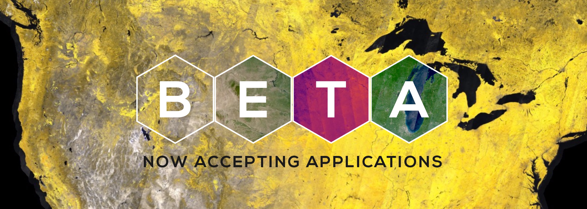
This spirit is in our Descartes Labs ethos. Actually, it is our ethos. By consolidating effort, we make the leap between asking ourselves a question in our heads to having results at our fingertips simpler, smoother, and more efficient. One way we’re working to consolidate effort is through the Descartes Labs Platform, which we are now opening to beta testers. This Google Cloud-based, hyper-scalable platform provides straightforward access through simple Python Client APIs to a complete archive of fully preprocessed, analysis-ready satellite imagery from the Landsat, MODIS, and Sentinel missions. So that question you’re asking yourself in your head? Go ahead and answer it.
One application we’re particularly interested in at Descartes Labs is global food markets and food security. In fact, the first major application of the Descartes Labs Platform was a U.S. Corn Production Forecast. Let’s see what we can do when we leverage the our Platform in conjunction with the vast amount of reference data available through land cover data sharing initiatives—let’s map global cropland.
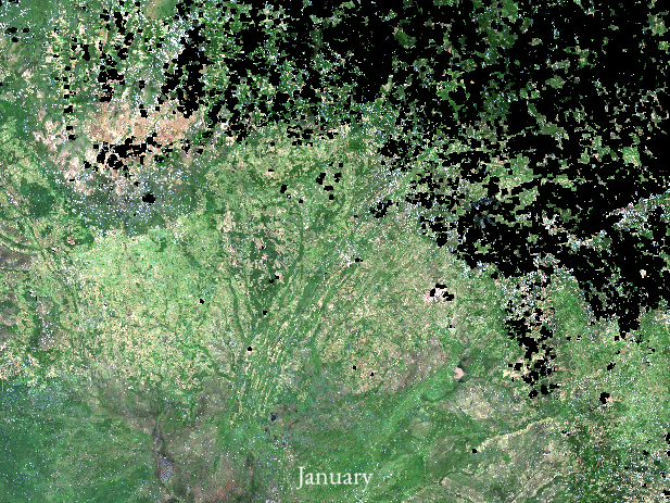
Given the rapid growth in agricultural production in Brazil over the past few decades, we’ll use Brazil as a test bed to develop and validate the methodology. Brazil also offers technical challenges that make it a great test case: its large land area, diversity of field sizes, and the pervasiveness of cloud cover necessitate methods that are robust to both missing data and inter-class variability, and the prevalence of cattle production requires methods that can discriminate between cropland and pastured grasslands, which can look strikingly similar. We’re up for the challenge.
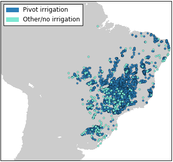
After cleaning the reference datasets—i.e. removing duplicate points, points with low labelling confidence, points with conflicting labels, and points with inadequate metadata—we can pull over 18,000 unique land cover reference points for Brazil from the GFSAD30 project and the environmental crowdsourcing project Geowiki. Most of these come from the GFSAD30 project. Since that project is particularly interested in irrigation, we can see that pivot irrigation is overrepresented in the reference dataset.
To augment the sample, we can pull cropland data from another source of global land cover data—existing cropland maps. Because cropland areas in these maps are predicted, rather than observed, we want to ensure that we are only selecting high confidence cropland pixels to train the model. To do this, we harmonize several independent sources of land cover information—namely the GFSAD30 classification, GLAM croplands extent, and croplands from the MODIS Land Cover Product—and identify areas consistently classified as cropland across all three datasets.
Now it’s time to gather our imagery. With access to over five petabytes of cleaned and calibrated satellite imagery, where to start? First we need to choose which satellite source(s) to utilize. Because crops have distinct temporal patterns related to their phenology, we want a data source with a high revisit rate that can capture each of these growth phases.
Let’s see how many satellite observations are collected in this area over the average month from each of the public satellites in our collection, using the Descartes Labs Platform:
# import libraries
import json
from datetime import datetime
import calendar
import random
import descarteslabs as dl
from descarteslabs.services import Places
from descarteslabs.services import Metadata
places = Places()
metadata = Metadata()
# get geometry for Brazil
brazil = places.shape('south-america_brazil')
# constellation ids of interest - MODIS, Landsat 8, Sentinel 2
const_ids = ['MO', 'L8', 'S2A']
# dates of interest (each month over 2016)
year = 2016
months = [str(r).zfill(2) for r in range(1,13)]
# let's grab 10 random locations within bounding box of brazil
minx, miny, maxx, maxy = brazil['bbox']
x = [random.uniform(minx,maxx) for r in range(10)]
y = [random.uniform(miny,maxy) for r in range(10)]
rois = zip(x,y)
print('Average number of monthly observations for 2016\n')
print('{:<20} {:>10}'.format('Satellite', 'Average number of observations'))
for const_id in const_ids:

 dates = []
 for roi in rois:

# set grid to 278x278 pixel raster, with 30m pixels
# gets geometry over an approx 1/4 km area around
 the x,y location
dltile = dl.raster.dltile_from_latlon(roi[0], roi[1], 30.0, 278, 0)

 for month in months:

# calculate time range from year and month
 last_day = calendar.monthrange(year,int(month))[1]
 start_time = '%s-%s-01' % (year, month)
 end_time = '%s-%s-%s' % (year, month, last_day)

# search for imagery from satellite over time range
 scenes = metadata.search(
 const_id=const_id,
 start_time=start_time,
 end_time=end_time,
 geom=json.dumps(
 dltile['geometry']
 ),
cloud_fraction=0.9,
 limit = 800
 )

# get acquisition dates for each image
 acquired = [x['properties']['acquired'] for x in
 scenes['features']]
# get the unique dates and append count to list
 days_of_imagery = set([a[8:10] for a in acquired])
 dates.append(len(days_of_imagery))
# calculate average number of observations over month
 av_obvs = sum(dates) / float(len(dates))
 print('{:<20} {:<5.2f} ({:>}-{} per month)'.format(
 const_id, av_obvs, min(dates), max(dates)))
From the output, we can see that significantly more observations are available from MODIS than the Landsat constellation or Sentinel-2 on a monthly basis over these locations in Brazil:
Average number of monthly observations for 2016
Satellite Average number of observations
['MO', 'MY'] 27.59 (7-30 per month)
['L8', 'L7', 'L5'] 0.41 (0-4 per month)
['S2A'] 0.10 (0-8 per month)
Searching for data from both the Terra and Aqua satellites, we can usually obtain one image over the area every 1–2 days. While we screened the imagery to only select scenes less than 90% cloud covered, many pixels in these images will still be cloudy. Thus, we don’t want to choose a data source with a much lower temporal resolution than MODIS, otherwise we risk missing important times of year. At Descartes Labs, we have pansharpened the visible (red, green, blue) and near-infrared (NIR) bands to a spatial resolution of 120m. With the red and NIR bands, we can also calculate the Normalized Difference Vegetation Index (NDVI). We’ll use these five spectral features for the classification.
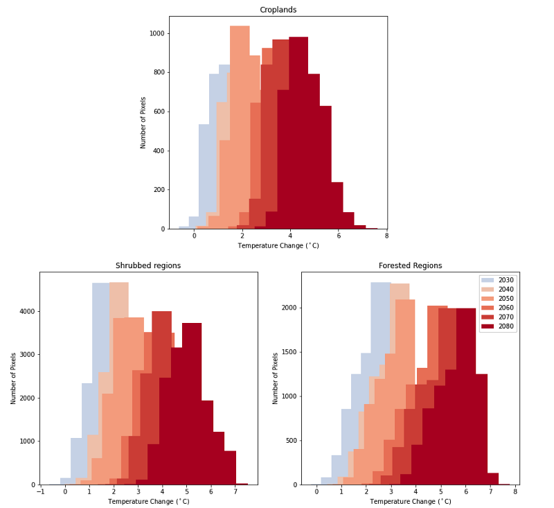
The frequency of cloudy days, coupled with the fact that relatively few phenological changes happen on a daily basis, means that we may not want to use every MODIS observation over the whole year. Instead, we can summarize the satellite data by compositing it over different timescales. For example, taking the mean pixel value over a month of observations will preserve the temporal information we want, but reduce the effect of missing or cloud contaminated data, and reduce correlated observations. It may also be helpful to summarize the data over the entire year. Calculating statistics such as the maximum, minimum, standard deviation, and quartiles of each pixel value provides information on the annual cycle of the land cover while significantly reducing the dimensionality of the dataset. If we assume a conservative two-day collection, with five spectral features for each observation, we would end up with over 900 predictor variables if we used every date of imagery. By temporally compositing the data to monthly and annual observations, we can reduce this by an order of magnitude and also end up with a more compact, cleaner dataset.
Interested in seeing how this can be implemented with the Platform? See the example in the docs!
Now that we have our image data and our reference points, we can create our training set. We’ll use a stratified random sampling technique to select a balanced training sample based on land cover class. For each training point, we will simply pair its label with the image data from the corresponding pixel. So what are the labels? Well, we could develop a binary (cropland vs. non-cropland) classification model, but we have access to much more detailed land cover information. Therefore, we’ll develop a multi-class classification, which should outperform a binary classification by reducing interclass variation. Because we pulled reference data from multiple sources, we need to standardize the data by aggregating labels into target land cover classes. The GFSAD30 and Geowiki class labels can be aggregated into eight general land cover classes: cropland, urban/developed, forest, grassland, shrubland, water, bare/barren, and wetland.
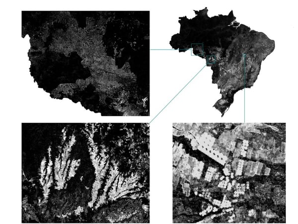
We’ll now use the random forest classifier from sklearn to build our classification model. A random forest is an ensemble method that uses decision trees as the base algorithm. Each tree in the ensemble makes a probabilistic class membership prediction at each pixel, which are then weighted and averaged to yield a final, class-conditional probability. After building the model, we apply it to each pixel across Brazil to produce probability estimates for each of the eight land cover classes. And the results are visually pretty striking:
Striking maybe, but how accurate? Using a holdout sample, we can validate the map accuracy at the pixel level. Before doing so, we need to choose a cutoff threshold for the cropland probabilities to produce a cropland extent map. As data scientists, we almost always prefer a data-driven approach.
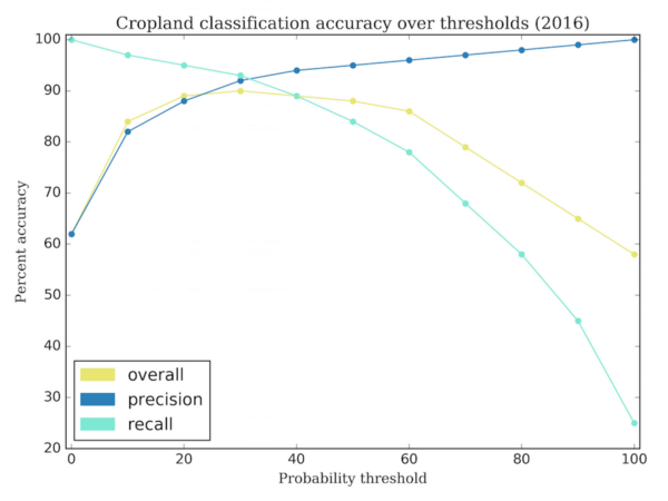
Globally, the highest cropland accuracy is achieved if we threshold cropland probabilities at 30%. In other words, if a pixel was predicted as over 30% likely to be cropland, we will call it cropland, otherwise we will call it non-cropland. Now that we have a discrete thematic map, we can run some standard validation statistics to investigate map errors.
At the country level, we estimate the Brazilian cropland map is 90% accurate, with omission errors (false negatives) and commission errors (false positives) both at 10%. This means that the map does not systematically underestimate or overestimate cropland, but confuses the two categories approximately 10% of the time.
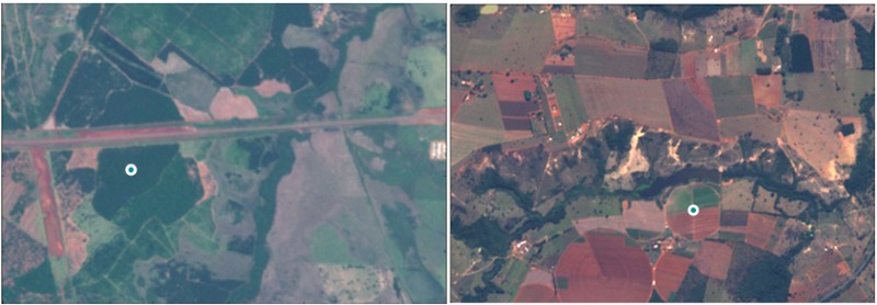
Taking a closer look, some of these errors are actually issues with the reference labelling, or a mismatch between the sampling unit of the reference data and the spatial resolution of the satellite imagery. In other cases, the classifier just got it plain wrong.
We can also look to the model itself to tell us about fit and performance. For example, we may wonder whether the image data features we chose were actually informative. Through the tree estimators, we can assess feature importance by looking at how often each feature was used to categorize pixels.
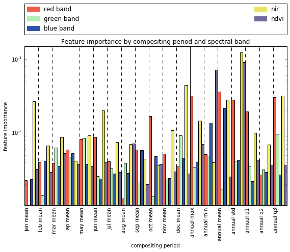
When we consider feature importances relevant to cropland identification, we can relate much of what we see back to the biophysical qualities of cropland. First, notice that the most important bands tend to be those most correlated with vegetation content and vegetation vigor, e.g. NIR, NDVI, and the red band. Across the time dimension, annual metrics related to intra-annual variability (standard deviation), difference in vegetation content throughout the year (annual max red and NIR, annual min NDVI) and monthly means near peak summer (December-January) and peak winter (June) are particularly important to discriminate between cropland and other land cover types in this region.
Now we get to ask ourselves more questions. Will additional reference data filtering reduce labelling uncertainty and map error? What other features could we add to improve discrimination between cropland and other spectrally similar land cover types? Given what we now know—how would you improve this model?
Descartes Labs’ technology makes it possible to ask the questions we want to ask. We’ve benefitted from this technology for some time, and we’re so excited to open it up to you now through the Descartes Labs Platform. Personally, after nearly ten years in land cover and remote sensing research in the academic and governmental realms, the Platform is changing the way that I do science:
Less time spent reaching the data I’m after, and all through a few simple Python API calls—meaning the Platform fits into my existing workflows rather than disrupts them. Starting now, you can test this out for yourself—sign on to be a beta tester and leverage the Platform in your own research.