Article category: Science & Technology, Climate Solutions
Mapping All of the Trees with Machine Learning
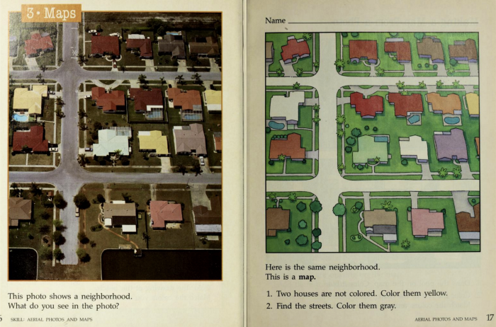
How do we fill in the gaps between official street tree census and trees in parks and on private...
Let’s cut to the chase. Artificial Intelligence (A.I.) is a buzzword that is applied to so many things that it almost has no meaning at all.
What isn’t A.I. these days?
We have A.I. on our phones and in our homes. (“Hey Siri, tell me how Alexa defines, ‘Ok, Google.’” … … 💥). We have endless videos of humans laughing at or “tormenting” robots in our social media feeds. A.I. has been a prominent thread in Hollywood for decades. It’s a whole big, sprawling phenomenon that can essentially be defined as any computer system with the ability to achieve goals in a complex, uncertain environment. (For more, check out these definitions.)
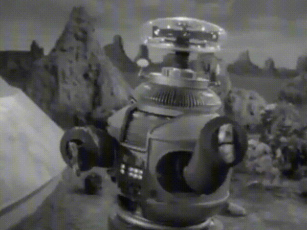
Ahem, yes, this includes the Robot from Lost in Space as much as it does facial recognition software and Netflix recommendations.
So, while I’ve titled this article Mapmaking in the Age of Artificial Intelligence, I am not writing about robots who (that?) make maps. What I am talking about is the practice of making maps in the context of the hype around A.I., and (crucially) that magical little corner of the A.I. universe where mapmakers are finding fertile ground: machine learning.
Machine learning. n. A technique that allows computer systems to improve with experience and data. (after Goodfellow, Bengio and Courville)
When you think about machine learning in the context of mapmaking, think lines of code, not KITT, The Terminator or AVA picking up a pen and drawing a world map.
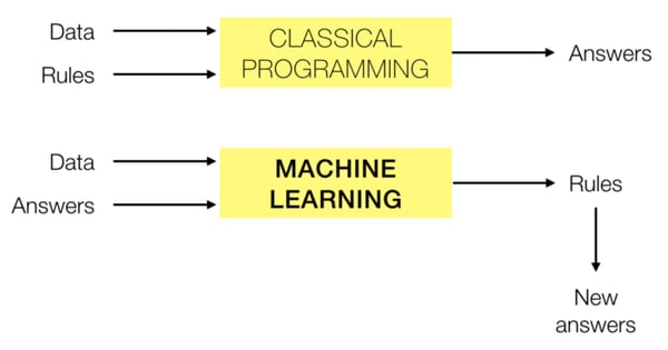
Compared to classical programming, which typically applies rules (basically, some math) to data in order to get answers, machine learning uses data and pre-determined conclusions about it (training data) to determine relationships that can help find more of those conclusions.
Hey, machine learning algorithm, here’s an aerial image with loads of cherry trees in it. Here are places where many of those cherry trees are — tell me where the rest are, please.
Generally, the more data you train the algorithm with (and the better that data captures the nuances of what you are looking for), the better the algorithm gets at finding more rules and relationships that define it. For locating those cherry trees, it would be ideal for your training to capture various blossom colors, tree sizes and branch patterns that exist in nature. But as with a human brain, if you pepper it with too much detail, the algorithm might well get confused. This is called over-fitting, and typically yields poor results.
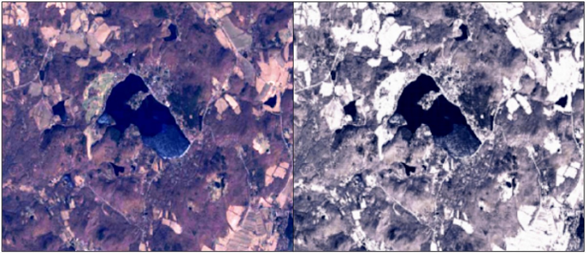
For an example of A.I. for mapping, let’s have a look at Adobe Photoshop’s content-aware fill tool. It’s difficult to know exactly what’s going on under the hood, but it’s safe to assume that it is an A.I. and does something akin to machine learning. Essentially it fills a selected area with patterns that exist elsewhere in the image based on proximity and similarity. (Adobe has recently expanded this technique to video!)
I should note, I first became aware of content-aware fill at a cartography conference, NACIS 2010, when Alex Tait demonstrated it as an alternative to the often clunky “clone tool” for touching up small areas—not trying for recreating entire landscapes. So, I’m well aware of how absurd and impractical the following examples are. They’re just illustrations of a technology, not recommendations for a mapmaking technique. 😉
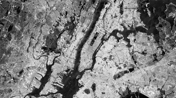
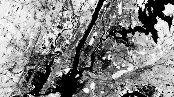
This is a Sentinel-2 image of New York City, before and after all of the water has been content-aware filled. This demonstrates both the power (which is kind of believable on the whole) and follies (when you look closely, this is ridiculous) of A.I. for satellite image processing.
Most of the water is filled with generic urban sprawl. The Hudson and East Rivers and Long Island Sound are mostly packed with “buildings and streets.” But there are some curiosities in here too. For instance:
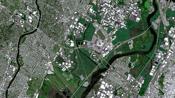
The Passaic and Hackensack Rivers in New Jersey get a beautiful green-up. Areas adjacent to the rivers are mostly wetlands—so they get packed with more wetlands! It almost looks natural.
Somewhat hilariously, over in the Bronx, by the Whitestone Bridge, Trump Golf Links gets supersized. About 50 holes are added to the course, which now meanders through most of the span between the Throggs Neck and Rikers Island. The field and track at Soundview Park are also replicated 3 and literally two-halves times. And, then, of course, this area also gets some generic urban sprawl.
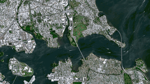
One of the best bits in this hypothetical composite is what content-aware fill suggests for the section of the East River just south of Roosevelt Island. Here, StuyTown is duplicated in full and it fits quite nicely between the United Nations and the Long Island City waterfront. Meanwhile, the FDR splits by the Con Edison power plant and very nearly makes it all of the way to Brooklyn before dead-ending jut short of what was Newtown Creek.
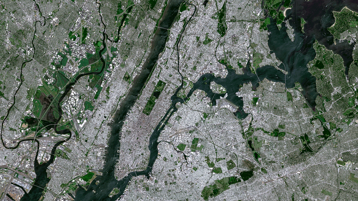
Since we’re already looking at New York City, let’s look at it some more.
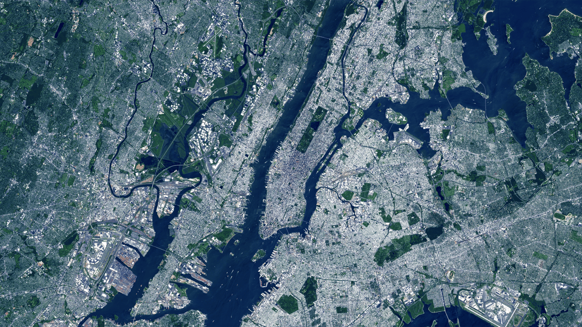
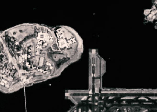
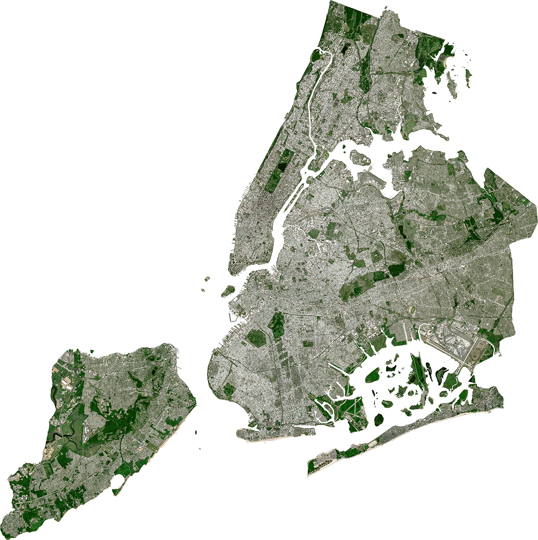
Here’s a Sentinel-2 image of New York on a pretty summer day. (Really, it was nice—high of 78° and clear). It looks like any picture you might take with your phone. In other words, it’s color. Or if you really want to get into the weeds, it’s true color (as opposed to false color). But unlike our eyes, which we use to perceive all of the colors at once, satellites like Sentinel-2 and Landsat-8 capture parts of the electromagnetic spectrum separately. So, the red, green and blue parts of the spectrum, or bands, are all captured separately. If you make a flip book-type animation out of the different bands, this separation reveals elements that are moving very quickly, as in this scene near LaGuardia Airport from January.
All of this is to say, you have to combine images of these different bands in order to make a true color image. Here’s what the red, green, and blue bands look like raw. The bright bits are the areas with the highest intensity of that color. Notice the blue band has brighter water than the red and green — because water often appears blue (or at least looked that way on July 7, 2018 😬).
When you combine these images into an RGB composite, you get the true-color image earlier. But there are other — arguably more interesting — things you can do with the bands from this satellite.
Let’s start with mapping vegetation using our old pal, the normalized difference vegetation index (NDVI). NDVI is a classical programming approach for mapping leafy and needly greens. Essentially, it’s just some math on bands: near infrared minus red divided by near infrared plus red. The result looks like this and the thickest, brightest vegetation is mapped with the brightest pixels:
If you want to get fancy, you can throw a color ramp on it to evoke the greenness of vegetation:
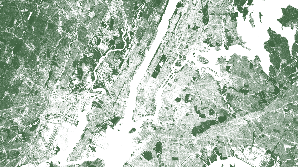
Here, with this classical programming technique, we can easily see trees and grassy areas in parks, golf courses, cemeteries, wetlands and street trees. NDVI does a great job mapping vegetation. That’s why we use it so much.
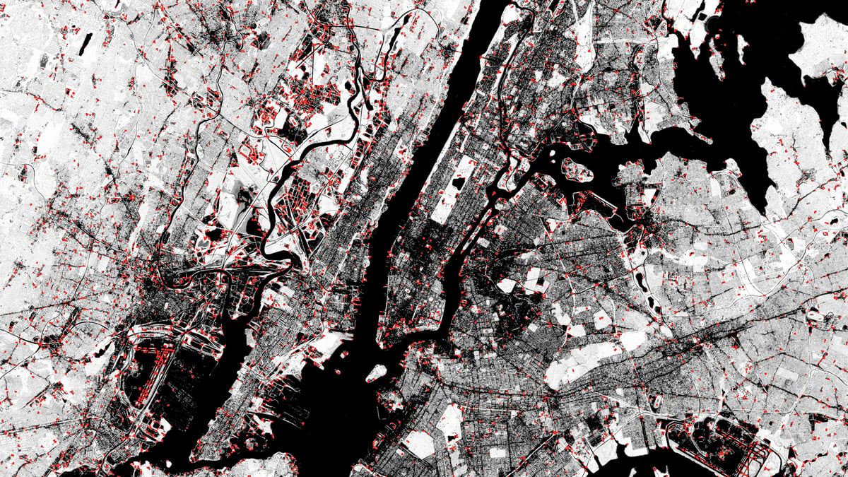
A term that is often conflated with machine learning is computer vision. In the context of satellite imagery, computer vision is generally used to identify patterns. In the example above, a computer vision model was used to find corners on the edges of vegetation in New York City. This method is not new (it’s from the 1980s) and it is not machine learning. It’s just some advanced math.
But computer vision has become more robust in recent years and people are using machine learning techniques along with it. Algorithms can identify patterns within images, identify them, classify them and segment them (cut them out of the background, or non-subject part of the image).
Imagine a family photo. A computer vision machine learning algorithm could be used to outline and label each family member, including the cat and dog (and fishbowl in the background). It might even be able to tell you which person’s Grandma!
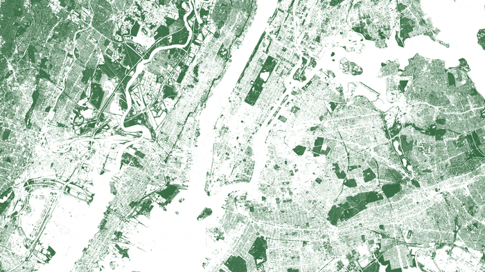
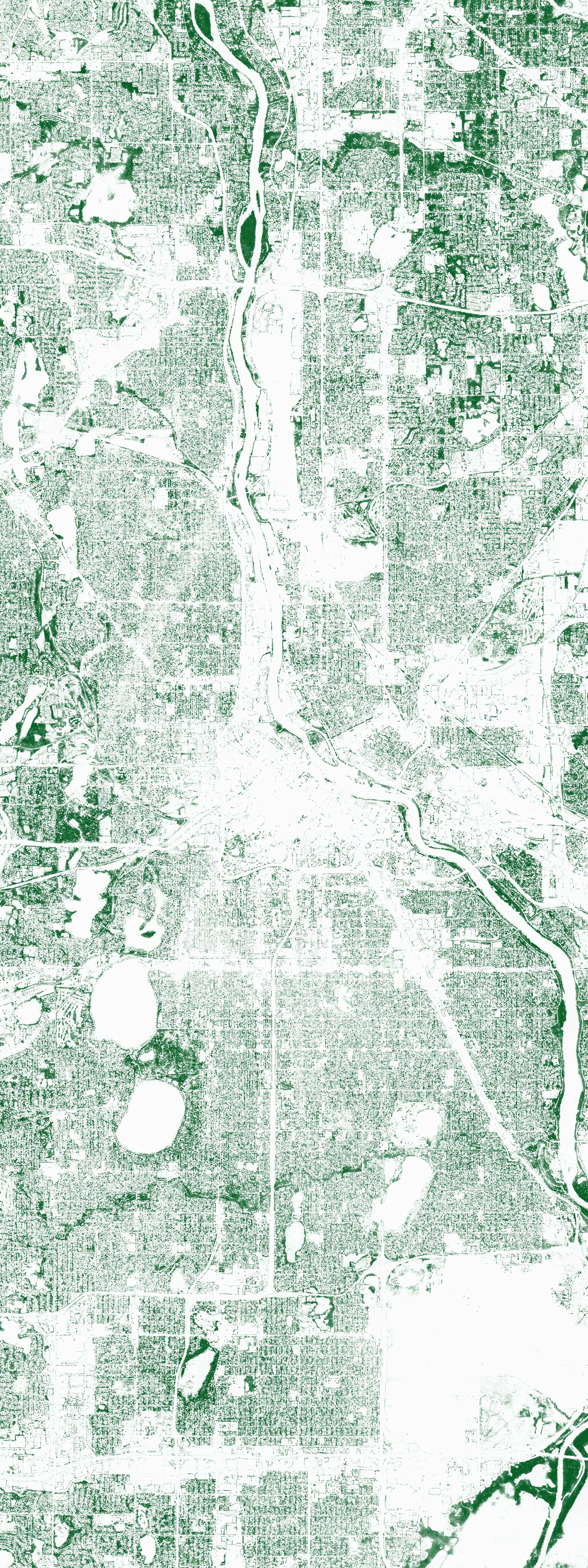
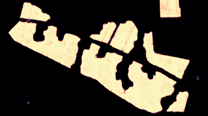
I’ve been over mapping trees using machine learning already, but it’s a perfect illustration of this point. In order to take the vegetation map of New York one step further, Descartes Labs used lidar data as ground truth to train a machine learning algorithm. Once that algorithm was trained, it could be applied to any traditional ~1m aerial or satellite imagery with a near infrared band. Above, we see NDVI compared to trees — grasslands in parks and marshland in New Jersey fade away when the tree map is brought to the forefront.
The business of mapping has always been gruelingly manual. So, throughout the history of cartography, whenever a new cartographic technique popped up, mapmakers typically embraced it in an effort to save time and improve their maps. When humans started taking flight in balloons, mapmakers scrambled to see this new view and use it in their maps. By the time photography was invented, mappers were poised to properly capture the aerial view and incorporate it into their mapmaking workflows.
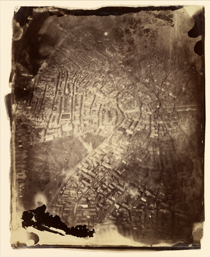
In the 1860s, James Wallace Black took what are considered the first aerial photos of anywhere in the United States—and the idea of mapping from balloons grew quickly. In 1862, Abraham Lincoln created a Balloon Corps under the Bureau of Topographical Engineers and they were tasked with spying on Confederate troops during the Peninsular Campaign in Virginia.

Cameras and other sensors were fixed to balloons—then planes, rockets and satellites all in barely a century. And once satellites were being launched, there was no looking back. Now we have countless satellites and drones actively mapping the surface of the globe at an ever-faster clip, at a higher resolution, and across more of the electromagnetic spectrum than ever. It’s almost too much data.
Almost.
This deluge of new sensor data would overwhelm a classical programming system. For the big questions we want to ask nowadays, the traditional process without cloud computing would take too long. Manually finding appropriate datasets and selecting features from them—even if the datasets are indexed perfectly—can be prohibitively time-consuming. And even when you do have the perfect dataset, cartographic processes, like classifying an image, are tedious and expensive.
But there’s hope! While we’ve had this onslaught of new sensor data—the proverbial sensor revolution—we’ve also witnessed an explosion of machine learning techniques that help mine the data quagmires for the the information we really want and need.
Here is an illustration from The New York Times showing building footprints in the Boston area. This image was assembled for a project that used Microsoft’s open-sourced buildings data, which was created using a machine learning algorithm. The open-sourced buildings data project was a colossal effort by Microsoft, one that produced “125,192,184 computer generated building footprints in all 50 US states.”
Looking at The New York Times maps, one immediately recognizes the potential power of using machine learning for mapping (if we can map all of the buildings in the country, what else can we map?!). But there’s one funny tidbit about this particular excerpt of Boston. While the Microsoft database works well over most of the country, it is far from perfect. (Nothing is perfect. Even if we had the ideal algorithm, perfect imagery to use as input across the entire country is a whole other ball of wax — and there’s no time for that here). So The New York Times patched detailed maps with local data sources. In this case, MassGIS.
The takeaway: having a machine learning algorithm that can produce results across a large geography is wonderful. But if a mapmaker has vetted local data for an area within that geography, it’s worth considering as an alternative. In other words:
Machine learning for mapmaking works great with an expert human helper!
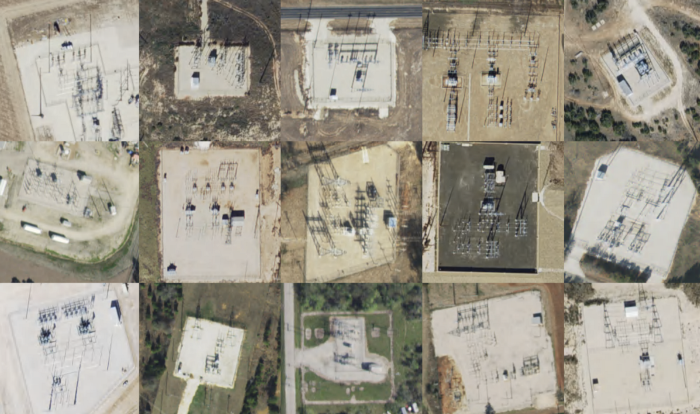
And when you do have an expert human helper, pretty amazing things can be done. Doreen Boyd at the University of Nottingham has mapped signs of slavery using machine learning. Several groups, including Microsoft have used machine learning techniques to map buildings. And Descartes Labs is using machine learning to map all kinds of things: power substations, wild fires, trees, solar panel installations, wind turbines, deforestation, oil & gas wells—the list truly goes on. If the human eye can recognize something as a unique pattern in the landscape, then there’s a really good chance we can teach an algorithm to see it too.
So, yes, as long as computer vision and machine learning continue to grow stronger and more refined, it could be a cartographic holy grail. What mapmaker wouldn’t want to train an algorithm to do all that manual work they once had to do? Then they can concentrate on the important parts—getting the story on the map as clear and beautiful as possible.
If I had to redo my now-decades-old Cartography 101 lab of classifying an aerial photo with colored pencils, I would absolutely ask an algorithm to help me.
I would just cross my fingers and hope that it didn’t do this:
Beep… beep… boop?
. . .
This post is a summary of the 2019 Mattson-New York Times Lecture which was given at The University of Southern Maine’s Osher Map Library on March 14. If you’re so inclined, you can watch the whole thing here.