Article category: Climate Solutions
Sharpening The Focus on Methane Emissions
The European Space Agency’s launch of the Sentinel-5P satellite in October of 2017 ushered in a new...

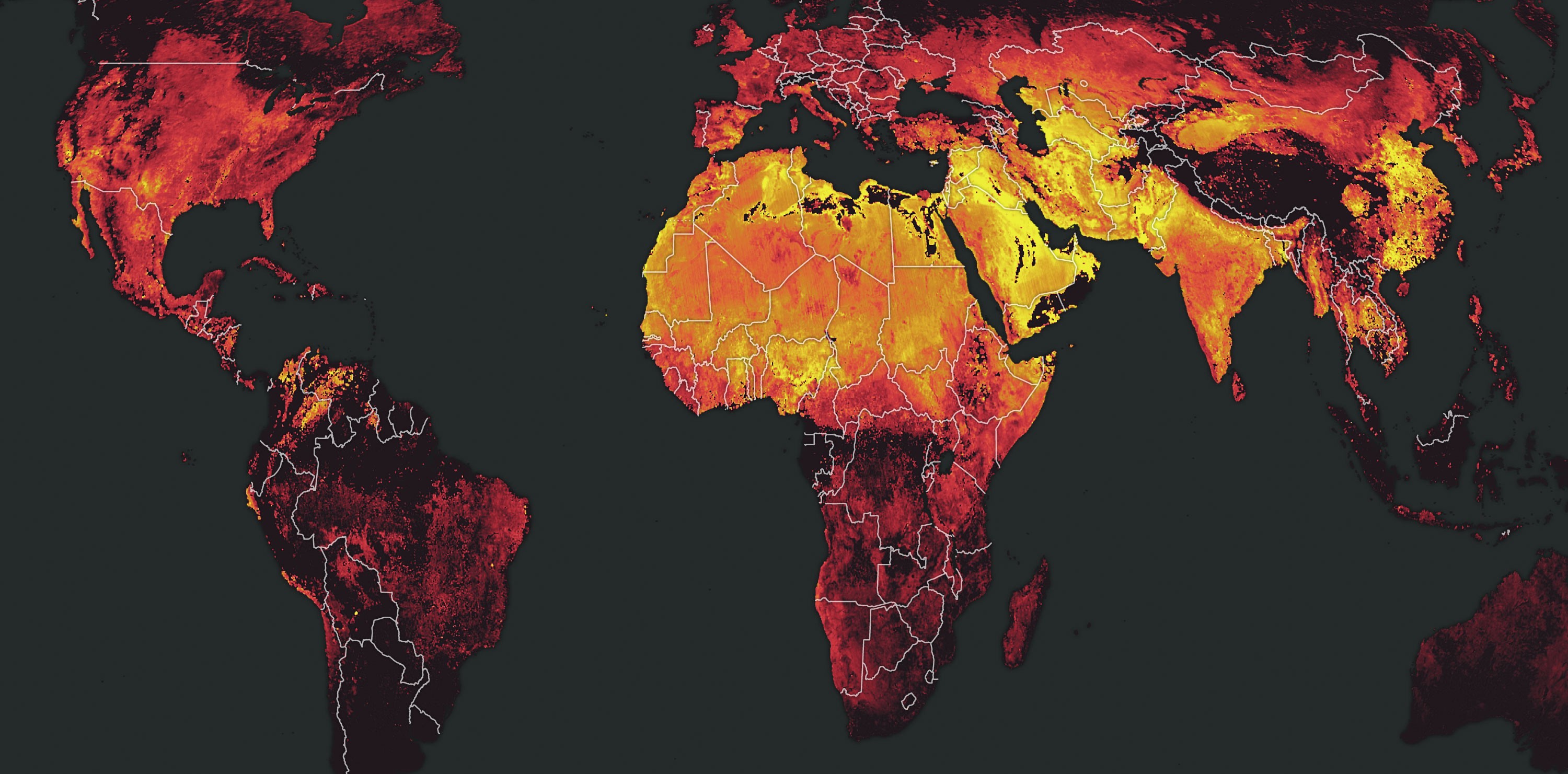
Unless you completely avoided modern society in August and September, you helped make this map.
If you were in a car, bus or train with a combustion engine, if you were in an electric vehicle that was charged using non-renewable energy or if you consumed something that was shipped to you on an actual ship—chances are, you contributed to this global composite of nitrogen dioxide (NO₂) made using data from ESA’s Sentinel-5P satellite.
NO₂ is a nasty-smelling, gaseous pollutant that is mostly the byproduct of the combustion process. It is, unsurprisingly, not good for you.
In a city, almost all of the NO₂ in the air comes from vehicle exhaust. Outside the urban environment, NO₂ is emitted in large quantities by power plants, factories and anything else that uses combustion as a matter of course. Basically, if you are burning fossil fuels to do anything, you’re creating NO₂.
And, as we all know, humankind burns quite a lot of fossil fuels to do all sorts of things. (At the risk of entering a rabbit hole, I might even point out that the creation and publication of this here blog post involved burning some fossil fuels.) NO₂ is nearly everywhere.
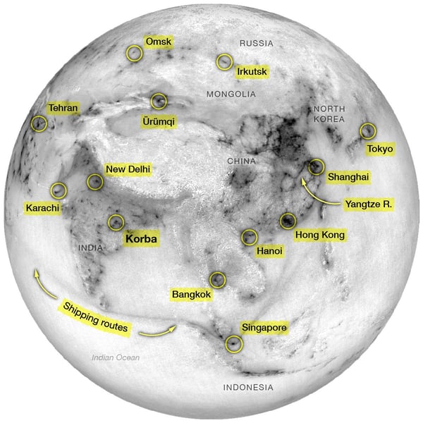
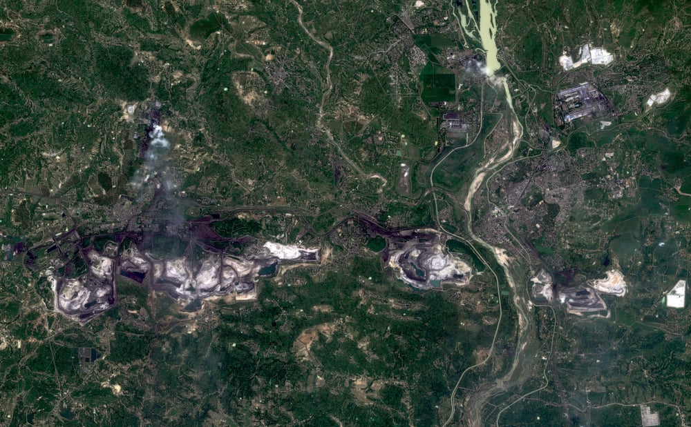
Most of the highest concentrations of NO₂ in this composite are in big cities—Tehran, Moscow, Lima, Mexico City, Beijing, Seoul, Jakarta. So, at first glance, a view of the world using just NO₂ looks somewhat like a population map. But it’s not. One of the dots in the map above, for example, is the town of Korba, India. The population of Korba is about 360,000, yet the highest concentrations of NO₂ levels around Korba in this composite were higher than all but two American cities (New York and Los Angeles). Why? Korba has industry. Power plants, mines (that produced 711,921,000 tons of coal in 2015) and factories kicked out this NO₂.
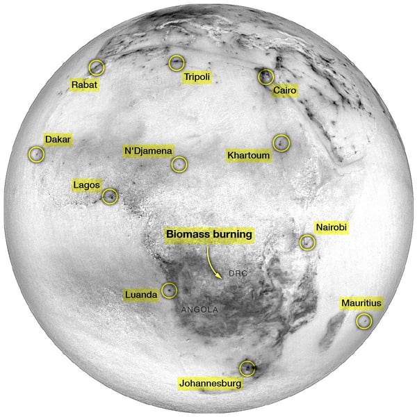
Not all of the NO₂ in the world is produced by big, noisy engines, however. Across much of south central Africa, in Angola, The Democratic Republic of Congo and Zambia, biomass fires create large quantities of this gas. Here, the massive area of concentrated NO₂ was likely caused by bush fires, forest fires and the use of wood for fuel.
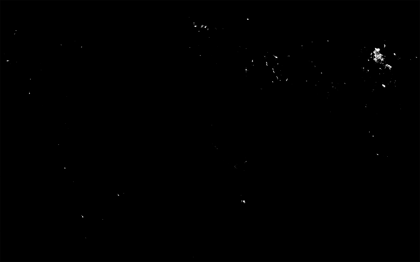
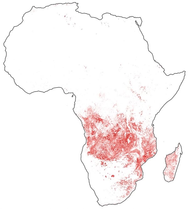
In fact, a quick look at observed fires during the same time period as the NO₂ composite reveals the same pattern.
North America had its fair share of wildfires last fall, but compared to those in Africa, the NO₂ produced by US fires barely registers. Instead, the NO₂ map of North America really does look like a population map, with a few quirks here and there. New York City, Los Angeles and Mexico City produced some of the highest concentrations of NO₂ in August and September. Smaller cities, like Fort McMurray in Canada and Monterrey in Mexico also registered.
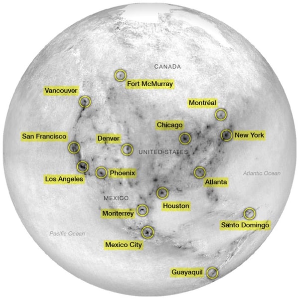
This picture of North America may look bad (and perhaps it is?), but according to the EPA, NO₂ emissions have fallen 60% in the United States since the 1980s. So imagine what it would have looked like 30 years ago!
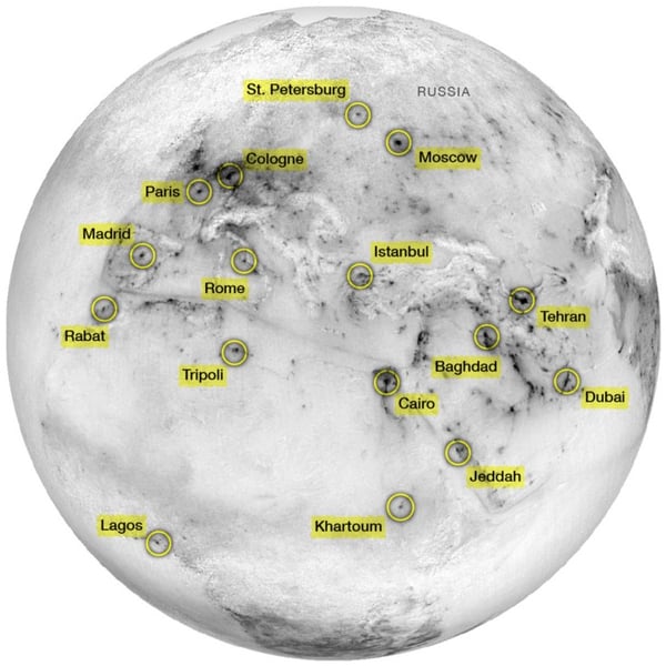
The map of Europe, North Africa and the Middle East highlights big cities too, but also Mediterranean shipping routes. Backing out to the global view once more shows how those shipping routes connect, through the Suez Canal, the Red Sea, the Gulf of Aden and across the Indian Ocean.
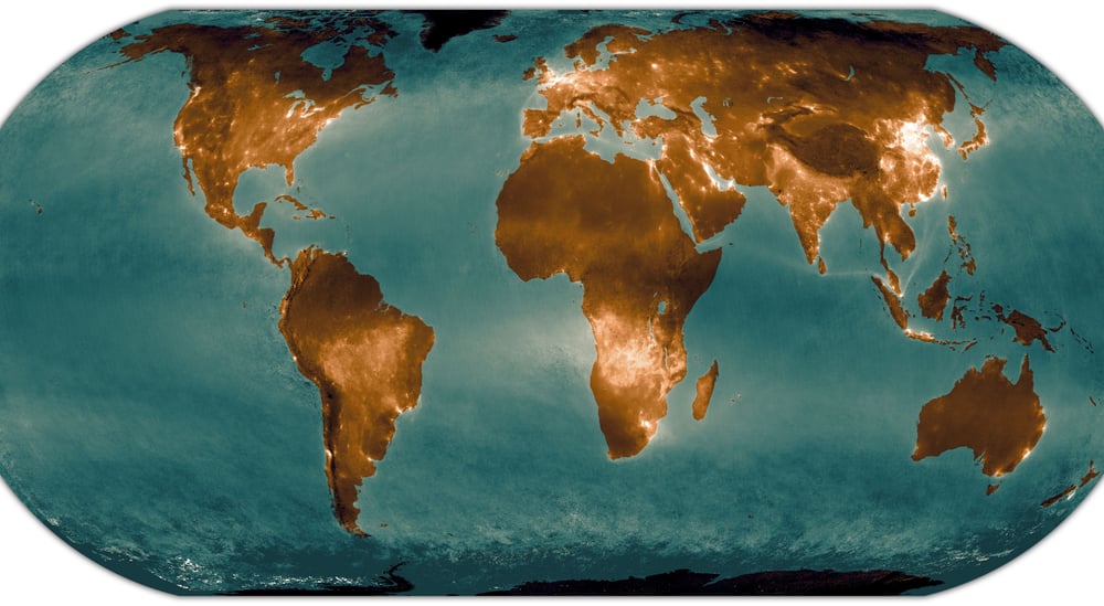
This planetary view of NO₂ is a ghostly shadow of humanity. Take it in for a moment. See the dark mountain regions, the bright port cities, the industrial towns, the world population centers. And imagine—if humans weren’t here, this map would be mostly blank.
Instead, the literal exhaust of our existence fires off a signal that, when mapped, could be used to navigate the globe.
. . .
Descartes Labs is building a digital twin of our planet. NO₂ and other gases measured by ESA’s new Sentinel-5P satellite are just a small part of what we are collecting and modeling to create better predictions of what’s next for us all.