Article category: Science & Technology
Mapping the land from space (in the Cloud)
There are at the very least six separate global land cover mapping efforts. The European Space...
The European Space Agency’s launch of the Sentinel-5P satellite in October of 2017 ushered in a new era of atmospheric monitoring from space. The instrument provides near-daily global measurements of ozone, NO₂, SO₂, formaldehyde, aerosol, carbon monoxide and, crucially, methane, a substantial component of global greenhouse gas emissions.
The enormous insight that Sentinel-5P provides into planetary emissions is extraordinary — but there’s a catch. Because, while some of these gases are relatively easy to measure from space (and drawing conclusions from their measurements is thus a fairly straightforward exercise), other gases are not so cut and dry.
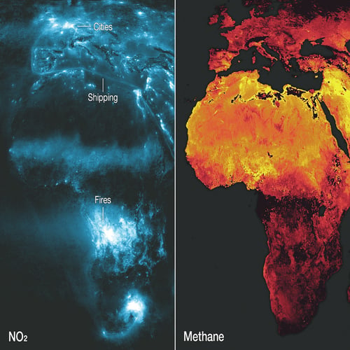
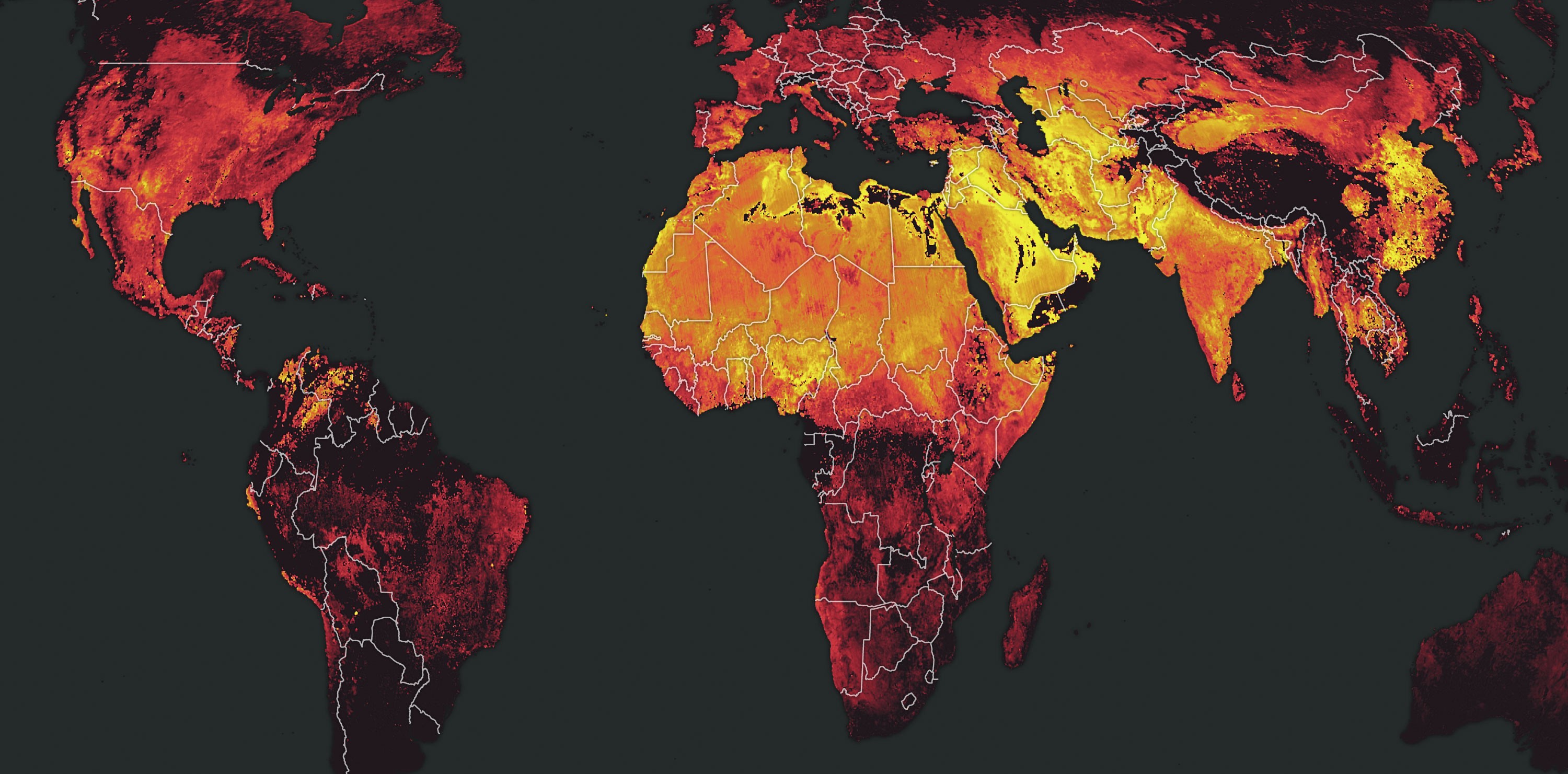
A look at NO₂ emissions across Africa and Europe, for instance, reveals a map that clearly identifies areas where things are burning. In other words, it’s neither complicated nor mysterious. When you study the NO₂ composite above, you can easily identify shipping lanes in the Mediterranean Sea, brush fires in Africa and highly populated cities throughout both continents. These points where emissions are being revealed make good sense — container ships have giant engines that burn huge amounts of fuel, brush fires are, well, fire, and large cities are home to millions of cars, large factories, and other sources that are all logically creating NO₂.
Methane is a whole other ball of wax (er, molecule of gas?). We think we know where it comes from; according to the EPA, for example, primary methane sources in the U.S. include coal mining, oil and gas infrastructure, landfills and, well, cows (we’ll get to them later). Even so, methane emissions are not so easy to map, at least partially because methane lives so much longer in the atmosphere than NO₂. In fact, methane sticks around for about a decade, while NO₂ lives for only a few hours. Plus, NO₂ dissolves in rain (remember acid rain? 😰) while methane keeps on keepin’ on.

To illustrate this difference, consider the old-timey video above. As you can see, the man to the left is lighting a cigar and blowing smoke around the room. Each frame of the video shows where the smoke is at a given second. The effect is much like our NO₂ composite above: a snapshot in time showing current concentrations of NO₂.
Now, on to the man smoking on the right. For this poor soul, the smoke does not dissipate. It simply spreads around and hangs in the air. It’s nearly impossible to distinguish new smoke from old, except on the expanding edges. Each moment in time, each frame in this video, has a noisier and more complex smoke pattern than the last. This cloud of smoke behaves like our methane in the other composite above: it’s a snapshot in time, on a scale of years, that reveals blurry accumulation.
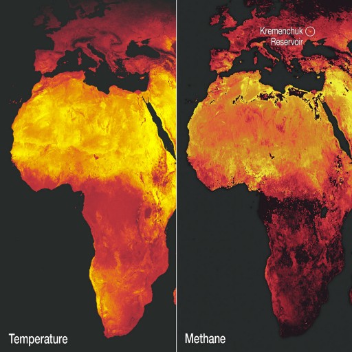
Exacerbating the ambiguity is what we at Descartes Labs have been informally referring to as The Sahara Effect, a barely-understood phenomenon that links bright exposed surfaces to an increase of 10 times methane’s heat-trapping properties. The Sahara Effect is on full display when comparing a simple land surface temperature map (or a solar power map) to the methane composite we created. In the comparison above, there are only a handful of bright, isolated differences between the two images. One of them is the Kremenchuk Reservoir in Ukraine, which has mysteriously registered extremely high levels of methane since January, 2019.
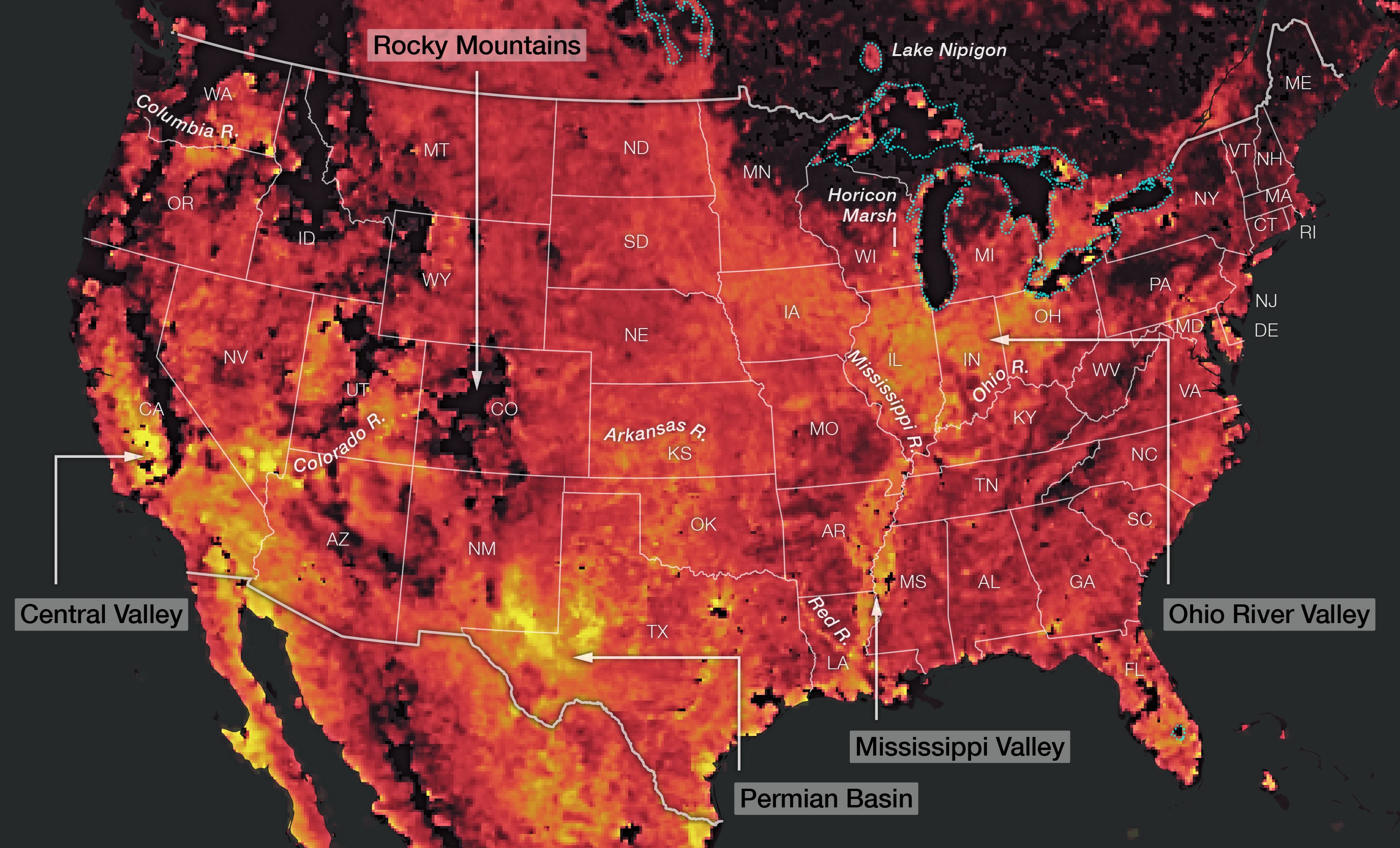
All this noise and confusion aside, the methane data coming off of Sentinel-5P is still illuminating. It may not be as useful for pin-pointing emission sources as the NO₂ data (notable hotspots like the Kremenchuk Reservoir excepted), but it definitely highlights some regional trends worth considering, even as we fine tune the data and our analysis.
Deciphering methane measurements presents some challenges, to be sure. But, as with any data set, if we continue to identify and work to understand the problems with the data, we’ll be better equipped to come up with solutions for interpreting it with a far higher degree of confidence as time goes on.
As demonstrated above, we’re already gleaning insights on methane from the observations provided by Sentinel-5P. The life expectancy of the satellite is 7–10 years — very close to the lifespan of a methane molecule in the atmosphere. As the satellite and its successors continue to take measurements over these years, we’ll get a clearer and clearer picture of where methane is, and where it’s coming from. Couple this with data drawn from highly precise air- and ground-based sensors, and we’re well on our way to a functional global methane emissions map. And that can spell truly positive change.
Think about it this way: atmospheric carbon dioxide concentrations can persist for thousands of years. It’s hard to imagine putting a dent in that kind of build-up. But while methane traps 30 times more heat per molecule than carbon dioxide, it only lives for a decade. By year 10 of Sentinel-5P, many of these methane mysteries will surely be solved — and we’ll have captured a data set representing an entire global lifecycle of methane, making it ever-clearer where action must be taken to reduce emissions of this harmful greenhouse gas.
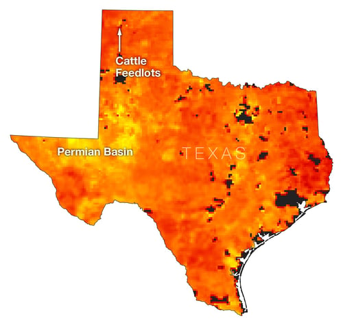
P.S. Yes, you can “see” cow belches and flatulence in the methane composite.
Descartes Labs is building a digital twin of our planet. Methane and other gases measured by ESA’s Sentinel-5P satellite are just a small part of the data we’re collecting and modeling to create better predictions of what’s next for us all.