Article category: Mining
Planetary Scale Intelligence for the Mining Super Cycle
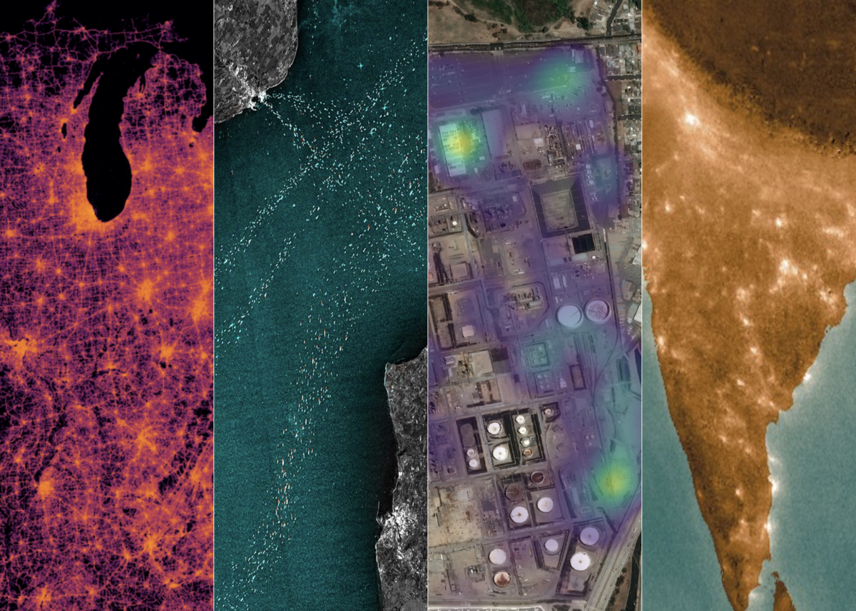
Sentinel-2 false color image of an area near Death Valley National Park, CA.Enhancing mineral...

We’re excited to announce the release of our Economic Activity Signals (EAS) quick-start package — a collection of geographic data feeds that track real-world behavior to help estimate daily changes in supply, demand, distribution, and the operational state of facilities on a global scale.
The package helps data science, procurement, sourcing, and business line leaders in agriculture, CPG, mining, materials, and industrials implement agile and resilient strategies using near-real-time data. By cleaning and combining premium vector datasets, EAS captures the following signals:
Tying all of these together, EAS can build a complete picture of daily activity around thousands of supply and demand networks. Retailers, consumer product manufacturers, raw material suppliers, and distributors can use this data to see what’s happening across the full spectrum of global activity. From the store all the way up to the truck, ship, factory, and field.
With these details in mind, let’s set the context for why EAS was developed and how it can provide value to organizations like yours.
Read on below or get in touch to discuss the details.
After weeks of warnings out of Asia and Europe, life started to change in the United States during the week of March 9th. COVID-19 cases doubled in multiple states and physical distancing became the new normal. Gatherings were banned, schools closed in waves, and for the first time in generations, America dealt with the reality of a major pandemic inside its own borders. Sheltering-at-home to flatten the curve punctured the normal equilibrium of life.
There are decades where nothing happens, and there are weeks where decades happen.
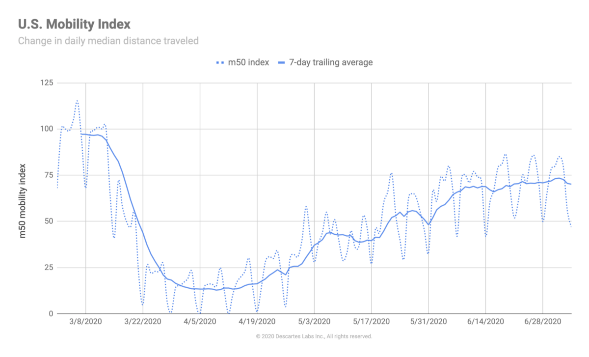
Our response early on at Descartes Labs was to quantify the effect of distancing policies on personal mobility and how the reductions in movement impacted consumer demand. Using our open-source mobility index, we built a time-series that tracked the daily median distance traveled within U.S. states, counties, municipalities, and select international countries.
Dropping roughly 75% in just seven days between March 14th–21st, the index captured the immediate impact of shelter-at-home policies on the nation and the evaporation of the daily commute. For millions of Americans, the shift to digital forms of interaction became suddenly safer and more reliable than physical ones.
In order to develop the mobility index, we use de-identified commercially available geolocation data. Our partners collect this data from applications that maintain the appropriate consents, approvals, and/or opt-ins, and it represents just a few percentage points of the overall number of devices available. We receive this data on a daily cadence and keep historical aggregations (over a year or more) to better understand the context in which changes are occurring.
The decline in mobility in March resulted in consumer demand shifts cascading throughout the economy. By late April, the share of people working from home shot up to 63% from 31% weeks earlier. Online sales increased by 10% in two months after rising only 10% over the past ten years. The daily habits of millions of Americans shifted in ways that supply networks couldn’t respond to fast enough. Our transition to digital-reliance felt like we were pulling the future forward ten years.
This new normal continues to produce far-reaching consequences for governments and businesses alike. Those that need to manage their organization’s response are asking:
As a result of questions like these from our customers, we set out to build EAS to allow organizations to answer their own supply and demand inquiries in an accessible way. To demonstrate how the data can be used, we explore a “cause and effect” hypothesis across the energy supply chain in the paragraphs below.
Hypothesis: Declines in physical retail demand → reduced driving → reduced auto sales → lower oil demand → lower oil refining and distribution → lower energy exploration → lower NO2 and methane emissions.
Stories about supply chains often get the headlines, but most disruption starts with shocks to consumer demand. Thomas Donahue, CEO of the U.S. Chamber of Commerce, commented about the breakdown in Chinese supply chains from COVID-19: “Most shortages were due to a huge increase in demand, not over-reliance on supplies from China.”
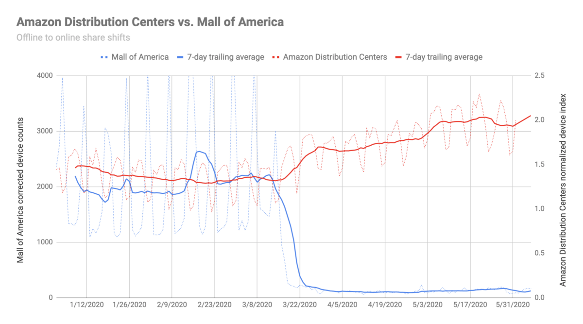
Using our commercial activity data, we can contrast changes in demand at different types of retail locations, including those that are considered essential and non-essential, and those that represent the growing bifurcation between online vs. offline. The actual on-the-ground change is captured in the Amazon vs. Mall of America chart below.
Immediate demand shifts like these can cause supply chains that were built for physical gathering spaces to go haywire. After years of over-optimization for restaurants, schools, and public events, their “just-in-time” nature wasn’t designed for an immediate transition to people spending way more time at home.
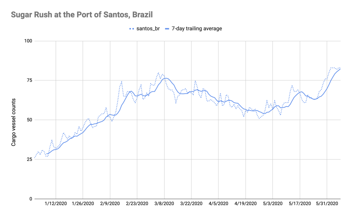
Cause and effect relationships extend beyond the point of purchase as well, meaning multimodal data from EAS can help shine a light on relationships up and down the supply network. For example, sugar was in the news recently with ships backed up at Brazil’s port of Santos as buyers fight to get ahead of possible supply disruptions in a country wracked by coronavirus. The spike in port activity starting in late-May can be seen in the maritime activity chart below. Having this data in real-time would’ve helped commodity buyers anticipate some of the supply issues.
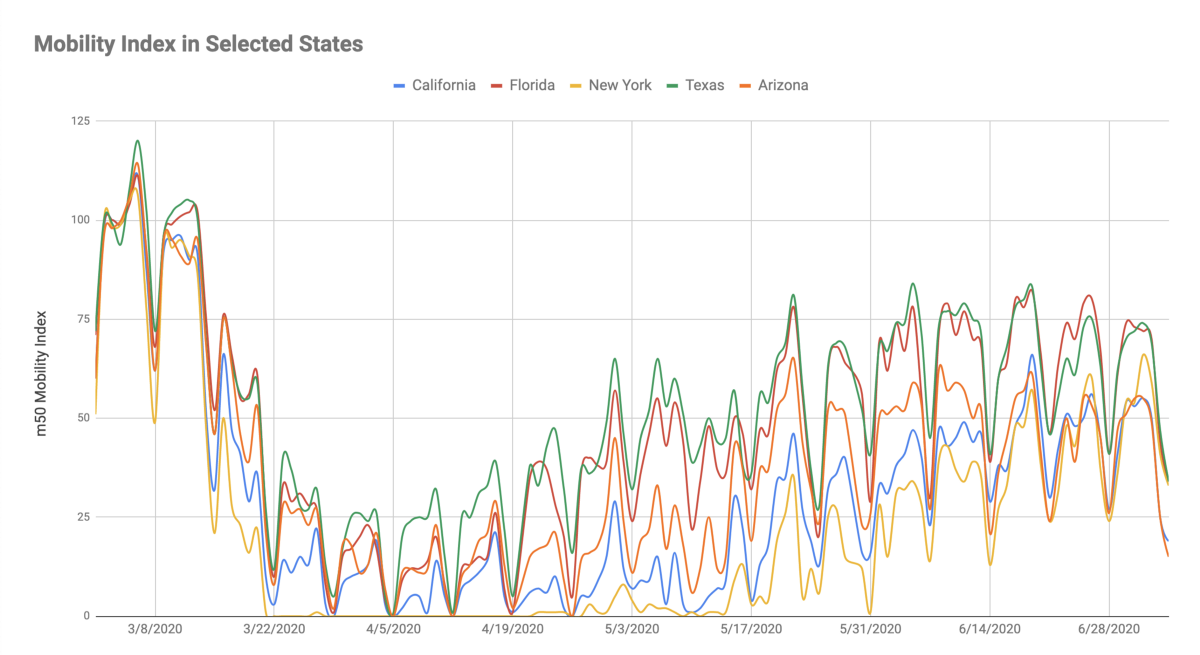
Since the beginning of May, we’ve seen a widening geographic spread in the mobility index compared to pre-pandemic levels. States on the coasts with higher-density urban environments haven’t returned to normal levels of mobility as quickly as rural states. This dispersion likely contributes to increasing case levels in southern and western states.
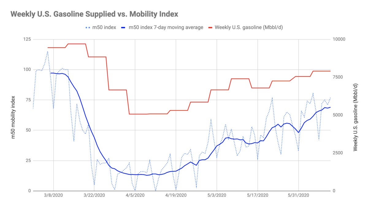
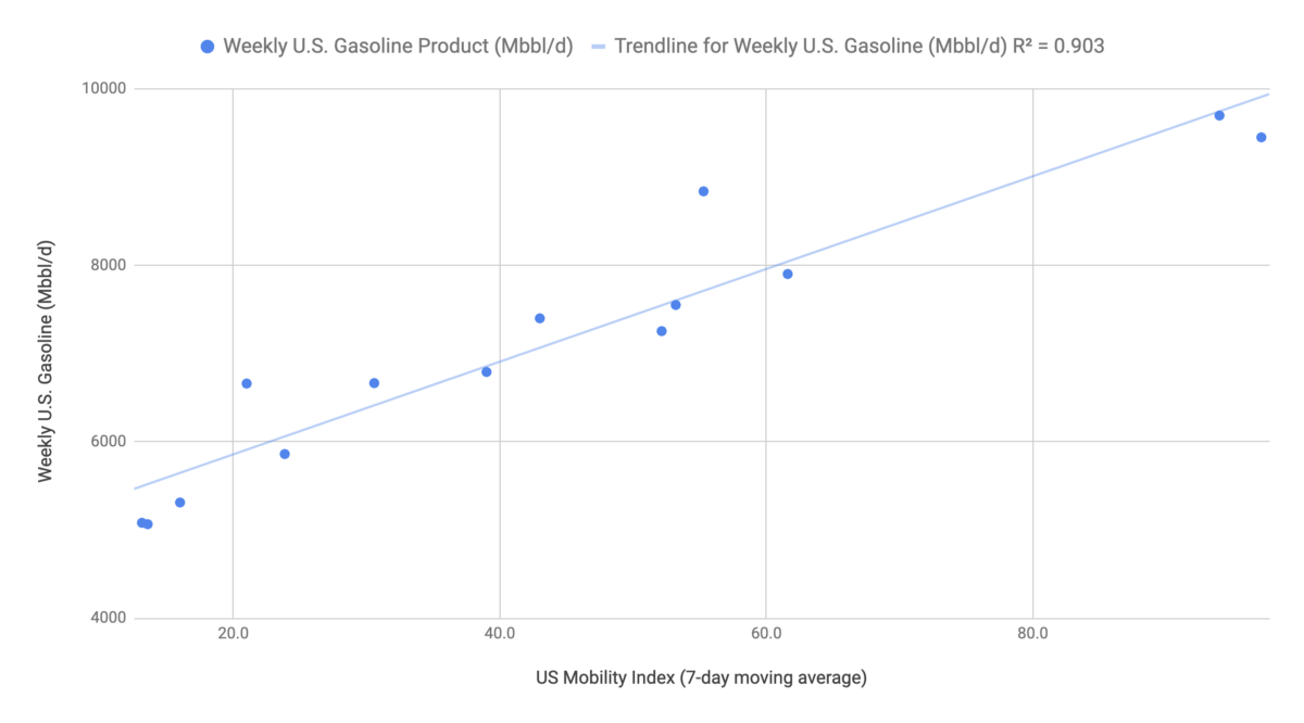
At the same time, we see a direct connection between reduced driving and a reduction in gasoline demand. This is evident in the 90% correlation between the Descartes Labs m50 mobility index and the EIA’s weekly gasoline demand in the chart and scatterplot below.
Work from home and the lack of demand for physical retail is hitting new car sales hard. Auto sales declined by huge amounts in the second quarter, due to the double impact of low consumer confidence and fewer miles on the road.
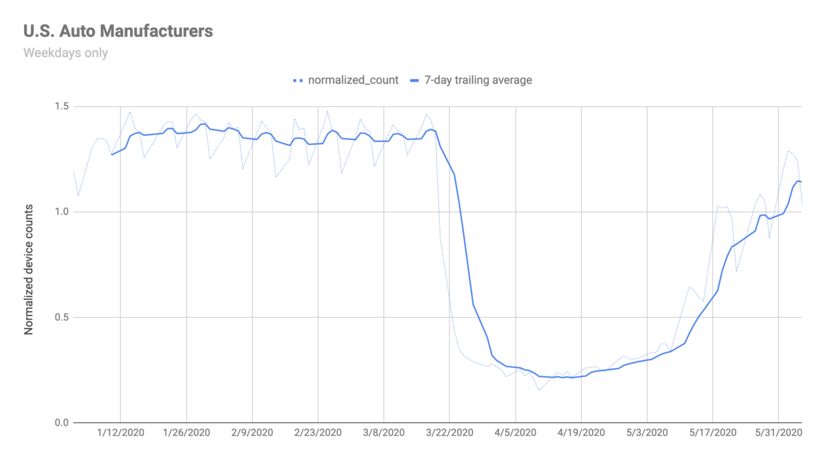
Automobile production lines around the world have been idled as a result and some are only now cautiously restarting production. This is reflected in the aggregated device counts at forty-five U.S. auto manufacturing facilities in the chart below. Access to data like this provides procurement insights into the consumption of thousands of input and output materials in the automotive supply chain.
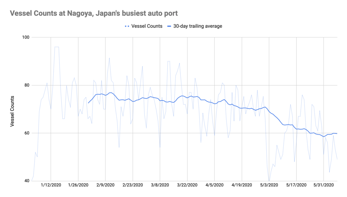
The trend is also visible in maritime activity counts at Nagoya, Japan’s busiest auto port, where Toyota ships vehicles around the world from its factories outside the city. Cargo vessels in the Port of Nagoya have declined roughly 20% since mid-March.
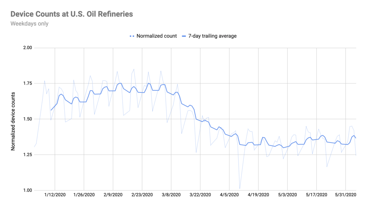
And with fewer vehicles being produced and purchased, the trend in employee activity at U.S. oil refineries has also plunged in recent months. The chart below shows normalized device counts aggregated across 173 U.S. oil refineries. This represents about a 51% drop from a peak in mid-February to the low in late-April.
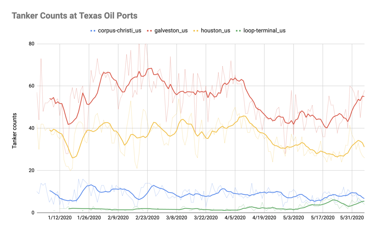
Moving from commercial facilities to maritime activity, the declines are also present at some of the major oil ports on the U.S. Gulf Coast. Interestingly, there was a small bump in activity in Houston and Galveston in late-March, followed by a large drop in activity in April coincident with the bottom in mobility across the U.S.
More recently, there’s been a pickup in activity at both ports, as well as increased activity at the LOOP terminal (Louisiana Offshore Oil Port), eighteen miles off the coast of Louisiana. Total counts at the LOOP terminal are low but most likely represent very large tankers.
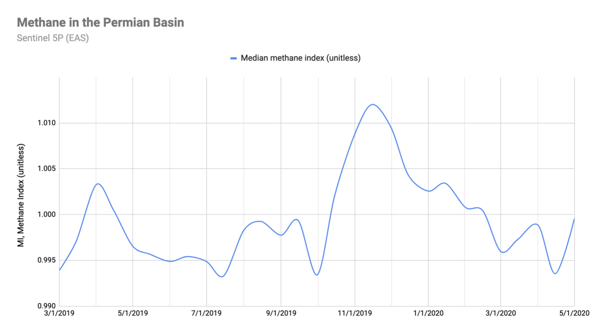
With extreme volatility hitting oil prices in April, it’s no surprise to see exploration and production in the Permian Basin fall as well. One might expect methane levels to fall as a result, but it’s not clear this is happening yet based on our regional pollution activity data.
Looking at methane levels in the Permian Basin, there’s a peak in December, likely influenced by expected higher readings of methane in the winter, followed by slightly more volatile detections since the pandemic began in March.
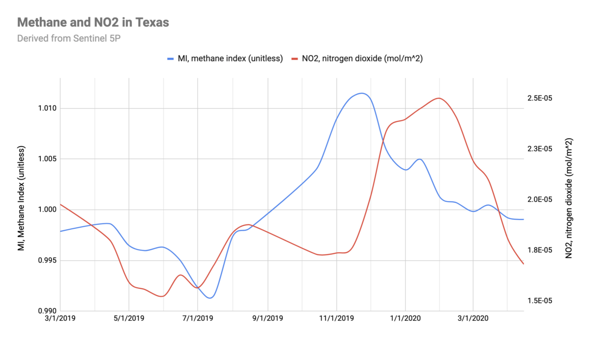
Zooming out to regional pollution data for all of Texas, one can see a similar winter peak in methane followed by slightly less volatile readings in the spring. Adding nitrogen dioxide (NO2) to the chart shows sharp declines compared to the same time last year.
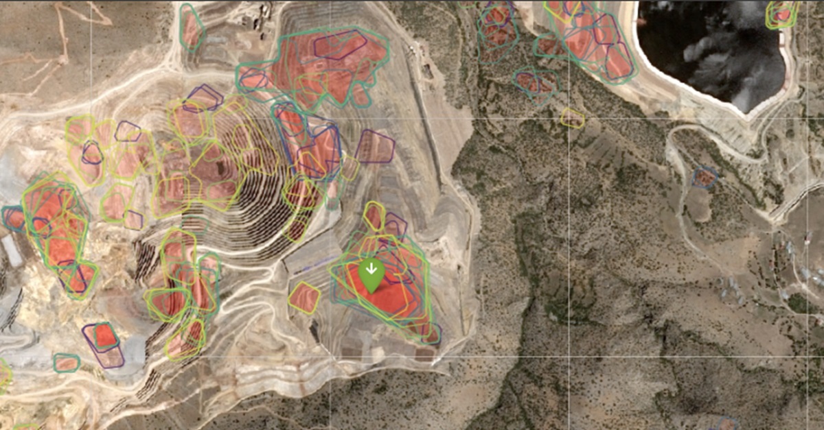
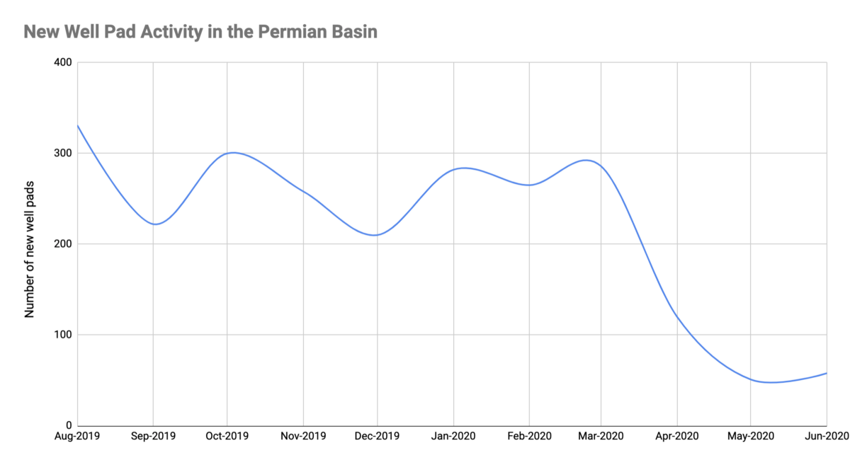
And while not included directly in the Economic Activity Signals quick-start package, our Applied Science and Solutions teams used the Descartes Labs Platform to build a computer vision model for a customer that detected an 80% decline in well pad development activity across the Permian during the month of April.
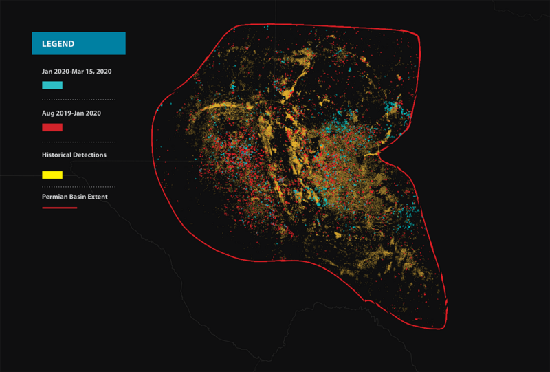
This data is the result of a segmentation model used to detect new well pad development in 10-meter resolution Sentinel-2 imagery. In the image below at right, the new Sentinel-2 detections at left are overlaid on a historical base layer of well pads extracted from 1.5-meter resolution Airbus SPOT imagery.
In a similar fashion, data from EAS can be imported into the platform to build sophisticated models that go beyond optical imagery, either by our Applied Science team or by customers themselves.

As the cross-modality examples above show, global supply and demand flows are interrelated and complicated. Economic disruption is affecting raw materials and product flows worldwide, causing freezes and disruptions at facilities and creating a strain on the way goods are produced, assembled, and delivered. The interconnected sourcing systems we’ve built have removed costs from our system but:
Our goal with EAS is to help our customers stop guessing about the timing and impact of disruption and instead use our signal data to make data-driven decisions about supply, production, and demand across key sourcing and distribution networks. Find out how you can interrogate your world with EAS.
Get in touch with us here to download an Economic Activity Signals datasheet or request a consultation with our team.
Learn more about Descartes Labs in general by visiting our platform or industries pages, resource library, or API documentation.